Colour Trend: Burgundy, Burnt Reds and Brick Tones
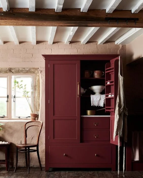
Image credit: deVOL
While this colour trend is perfectly suited for the current season of autumn, I’ve noticed a steady build-up of burgundy and deep reddish-brown or orange tones being featured in some of the most eye-catching room design schemes throughout the year. Warm, inviting and the perfect accompaniment to neutral shades of grey or taupe, these colours work well as a vibrant hit of colour on a single piece of furniture. They are also brilliant as ‘feature framing’ shades when used to highlight and outline windows or bookcases.

Image Credit: Lovely Life
If you have never thought about using red in your home before, you are not alone. Red was always a big no for me (along with brown or yellow); yet, I’m now a huge convert to burgundy and brick colours and I’ve also found myself recently getting really on board with natural brown tones and shades of yellow-tinged ochre. They are all colours that look brilliant if they are done well.

I recently painted this IKEA hacked cabinet in Picture Gallery Red by Farrow & Ball.
The key with this colour trend is to stick to rich, plummy reds and warm rusty tones. Keep away from bright pillar box reds and vibrant pink undertoned reds (which are more feisty and flamboyant). Think full-bodied red wine shades or reds with underlying hints of terracotta. Brilliant paint colours include Picture Gallery Red by Farrow & Ball, Bordeaux by Zoffany, Refectory Red by deVOL Paint and ‘Arrus’ by Little Greene Paint Company. For fabric, try ‘Omega Brick’ from Linwood (which is just the most perfect shade).

Cupboard painted in Arras by Little Greene
If you are going to use these colours on every wall in the room, you have to go all-in for that luxury cocktail club look for it to work. This is why, for me, using it sparingly is key (these are strong colours that draw the eye, so consider where they might work in your home). If you have a plain, neutral room but you want to warm it up, a key piece of furniture such as a sofa or a bed in a rich burgundy hue is really all you need.

Soho Home Manette Bed in Velvet Rust

Image credit: swantje hinrichsen

Design: SJ Studio. Photographer: Sam Frost Studio
A really clever way to use these rich tones is to paint your woodwork in them - they instantly frame and highlight internal doors, windows, and built-in furniture. It has been a popular trend to paint windows and doors black rather than white in the last five years, but now it is quite common to see frames and architraves painted in deep greens, blues, and these deep reds. Bookcases and wardrobes benefit from being accentuated by these colours as they draw attention to the detail rather than ‘blending in’ with the rest of the room.

Image Credit: House With Hannah on Instagram

Matilda Goad's home as featured in House & Garden

The wardrobe painted in Pompadour by Edward Bulmer Paint creates a sense of warmth in this stone cottage bedroom. Image Credit: The Little Stone Cottage
As I mentioned at the start, one of the best things about this group of colours is their ability to work so well alongside muted hues and neutral tones. You may want to play it safe in the majority of the room with whites, greys and soft greens - but a brick coloured bath or a rich burgundy kitchen island will completely lift the space and give it a whole other dimension.

Photograph by Paul Massey. Design by Ben Pentreath.

Image credit: JT Grupa
Finally, if you do want it on the wall, it works wonders on wood panelling as it emphasises all the grooves and details (as seen below in The House On Dolphin Street and in a boot room by Fiona Duke Interiors).

Image credit: The House On Dolphin Street

Image Credit: Fiona Duke Interiors

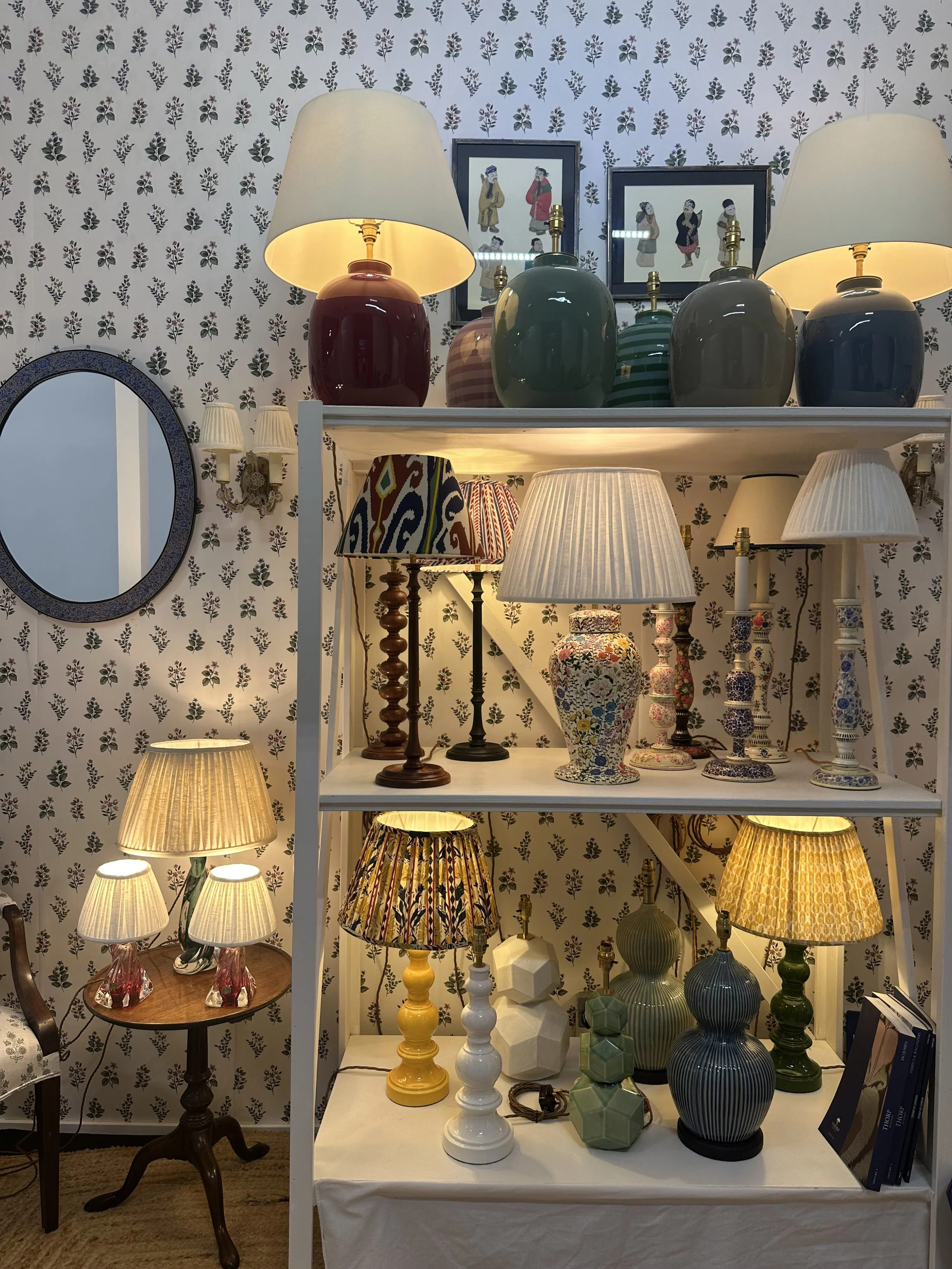
Muuto Unfold Pendant Light-Burgundy / 2. Little Women Duo / 3. Flowerpot Pendant / 4. Soho Home Rust Rug / 5. Hay Toothbrush Holder / 6. Chest Kassl Editions Zara Home / 7. Conchita Woven Placemats Set of Four / 8. Akiko chair / 9. Soho Home Lovett in Paprika / 10. Unari Rust Velvet Cushion / 11. Pooky Lamp Base / 12. Bellhop Portable Lamp / 13. Anthropologie Candle Holder