Before & After: Designing A Low-Budget Bedroom For Two Young Boys
A really fun styling job I have completed recently was to transform a blank room into a bedroom for two very much adored grandchildren for when they come to stay. The boys, aged 6 and 5, are both pretty cool kids, so I wanted to design them a room that was a bit trendy and they wouldn't grow out of too fast.
The bedroom as it stood was completely empty, so I needed to buy everything for the boys ready for when they were due to stay in a few weeks time. This included beds, mattresses, bedding, lights and window treatments. As this room was not going to be a room in use everyday, the aim was to create something within a reasonably low budget. To achieve this, I sourced everything for the room from homeware departments in supermarkets, Ikea, and the cheaper end of the high street.
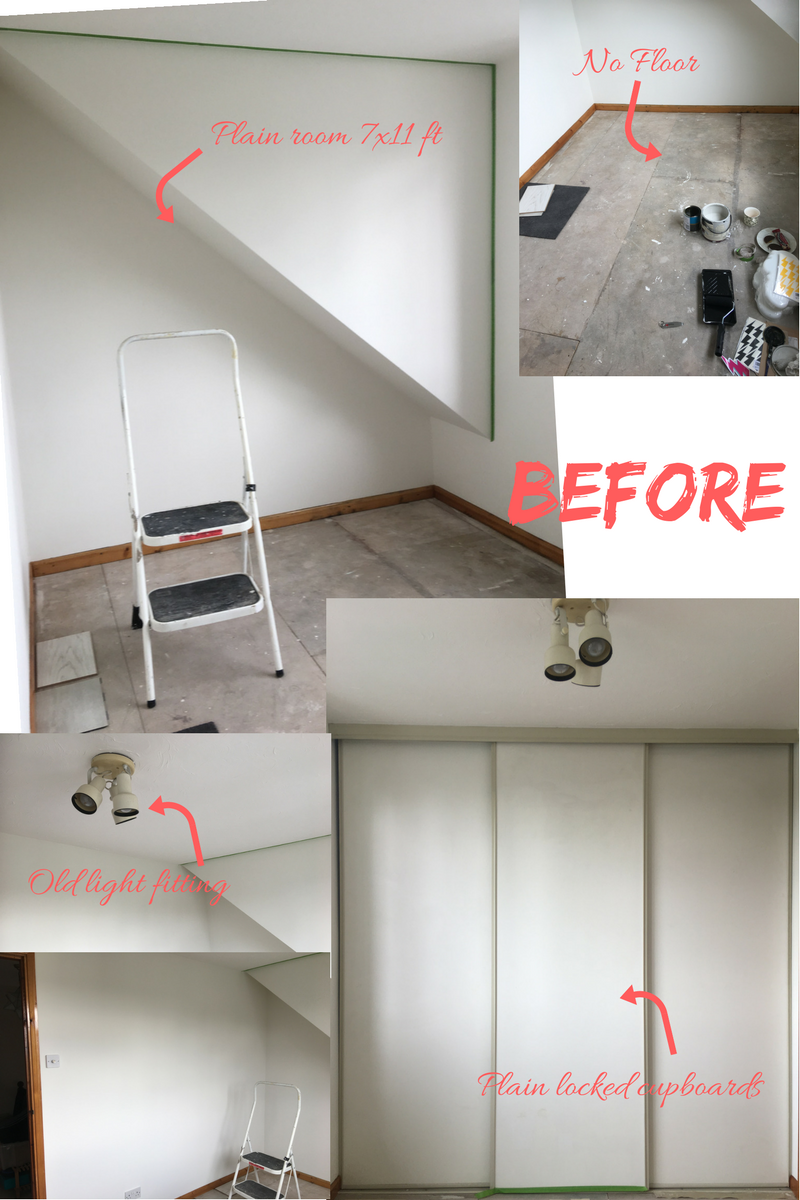
So this was how the room started out. There had been some damp at the far end so my clients had put in a stud wall and the room had a fresh coat of pure brilliant white emulsion applied:
The cupboards at the end of the room were used for storage, so were to be locked and not accessible for the boys. The existing light fitting was old and yellowed so that needed to be replaced. The old carpet had been taken up and new flooring needed to be laid.
When designing the room I put together a colour palette of white, black, yellow and grey. The colours, although not obviously 'childlike', had a fun, youthful but modern connotation when combined. The walls were to stay white so this colour provided the base, while the grey works well with yellow and could be used to balance out this colour so it wasn't overpowering. I knew I wanted to paint the locked cupboards in a chalk board paint so that they would be made a feature, so that's where the black came in:
Before I could put anything in the room, I had to do the required decorating needed for the decor scheme to work. To bring in the grey from the colour palette, I painted the the slanted box wall with a tester pot of Pavilion Gray estate emulsion by Farrow & Ball. I love this grey as it is quite a light grey, but still has great depth of colour. Two out of the three floor to ceiling cupboard doors at the other end of the room I painted in chalk paint (the idea being one board for each grandchild). The final cupboard I painted in the grey that I had painted the opposite wall in to tie the room together.
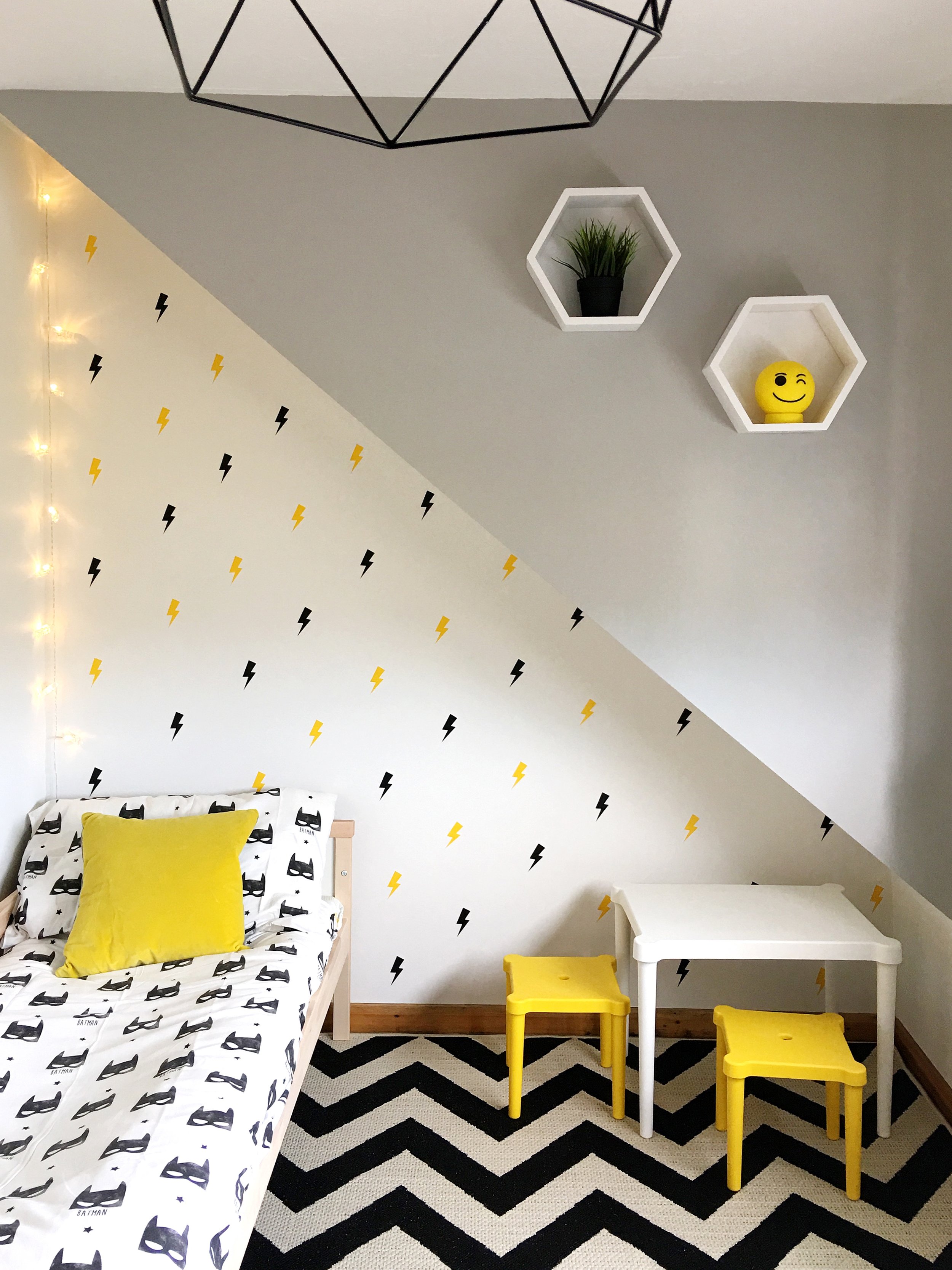
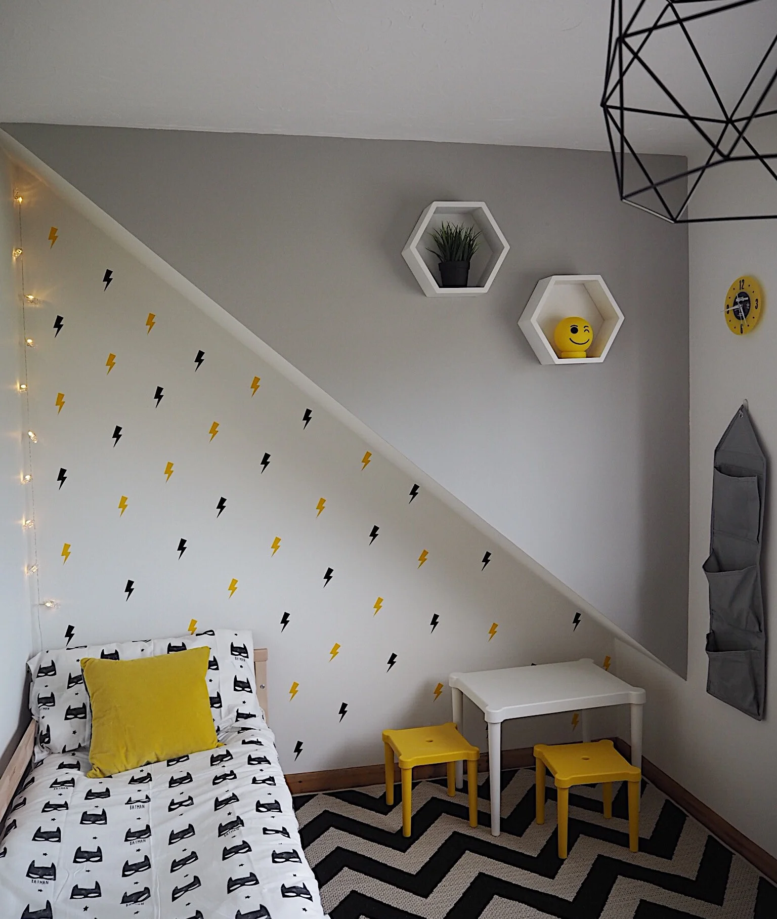
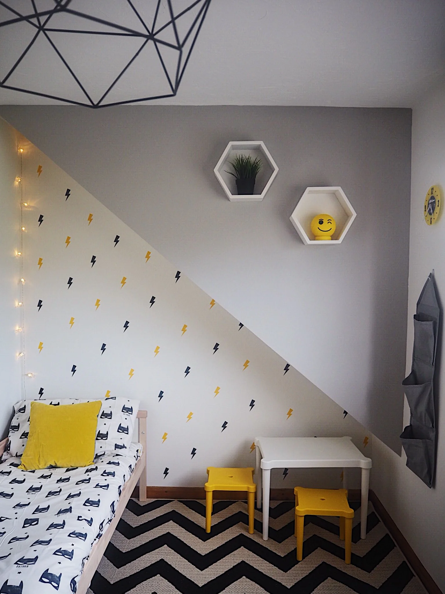
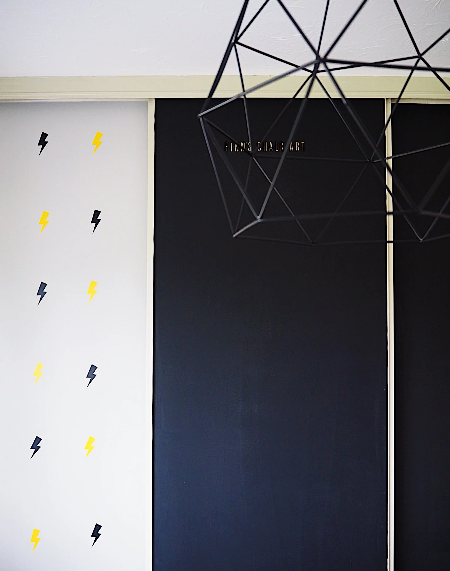
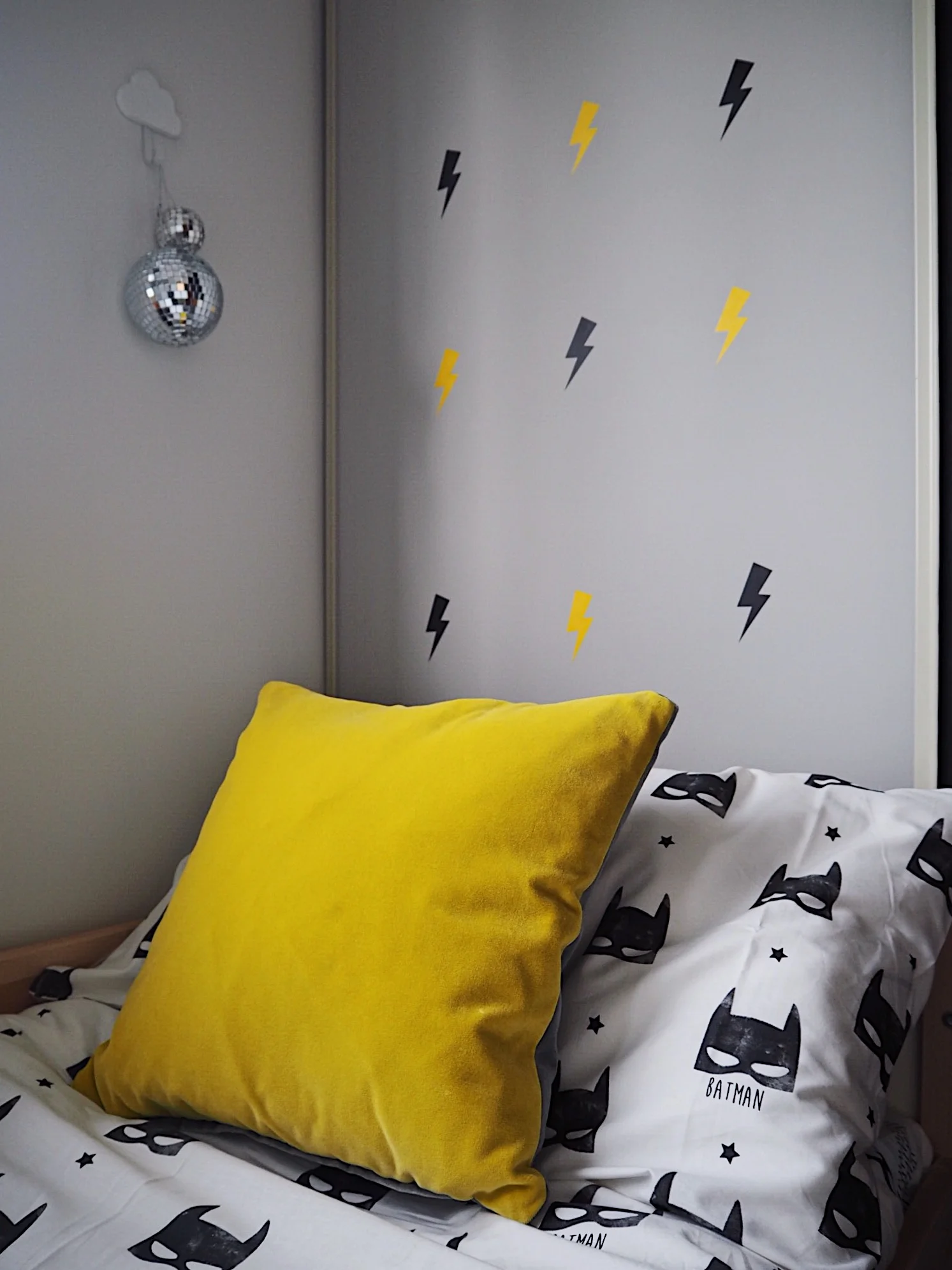
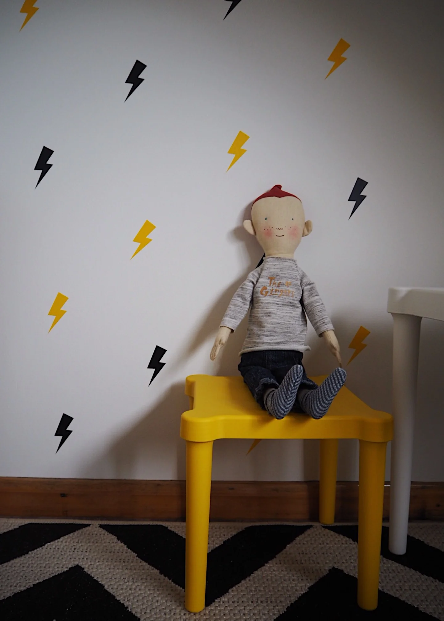
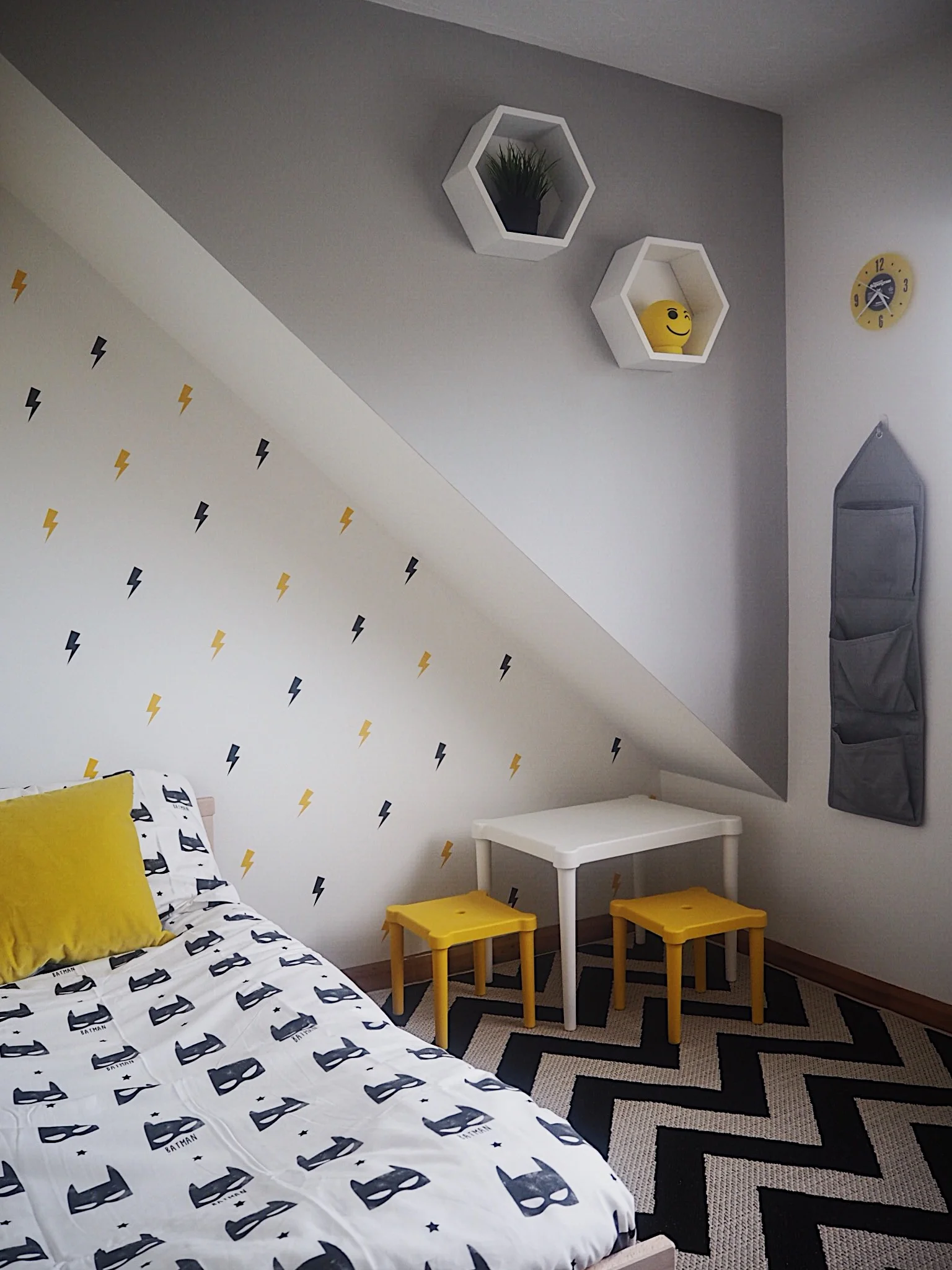
I also brought these lightening bolt wall stickers in yellow and black from Amazon, which were £5.99 for a pack of 48. You simply peel them off and stick them on the wall in your desired pattern. I thought this was such good value for money and was a great way to bring yellow and black onto the walls of the room without the need for wallpaper or art:
Together with the client, we decided that a light grey vinyl floor be laid. I knew I wanted to add a large black and white chevron rug in this room for layering and pattern, so vinyl was a good budget, easy to install, wipeable option for the 11 x7 ft floor.
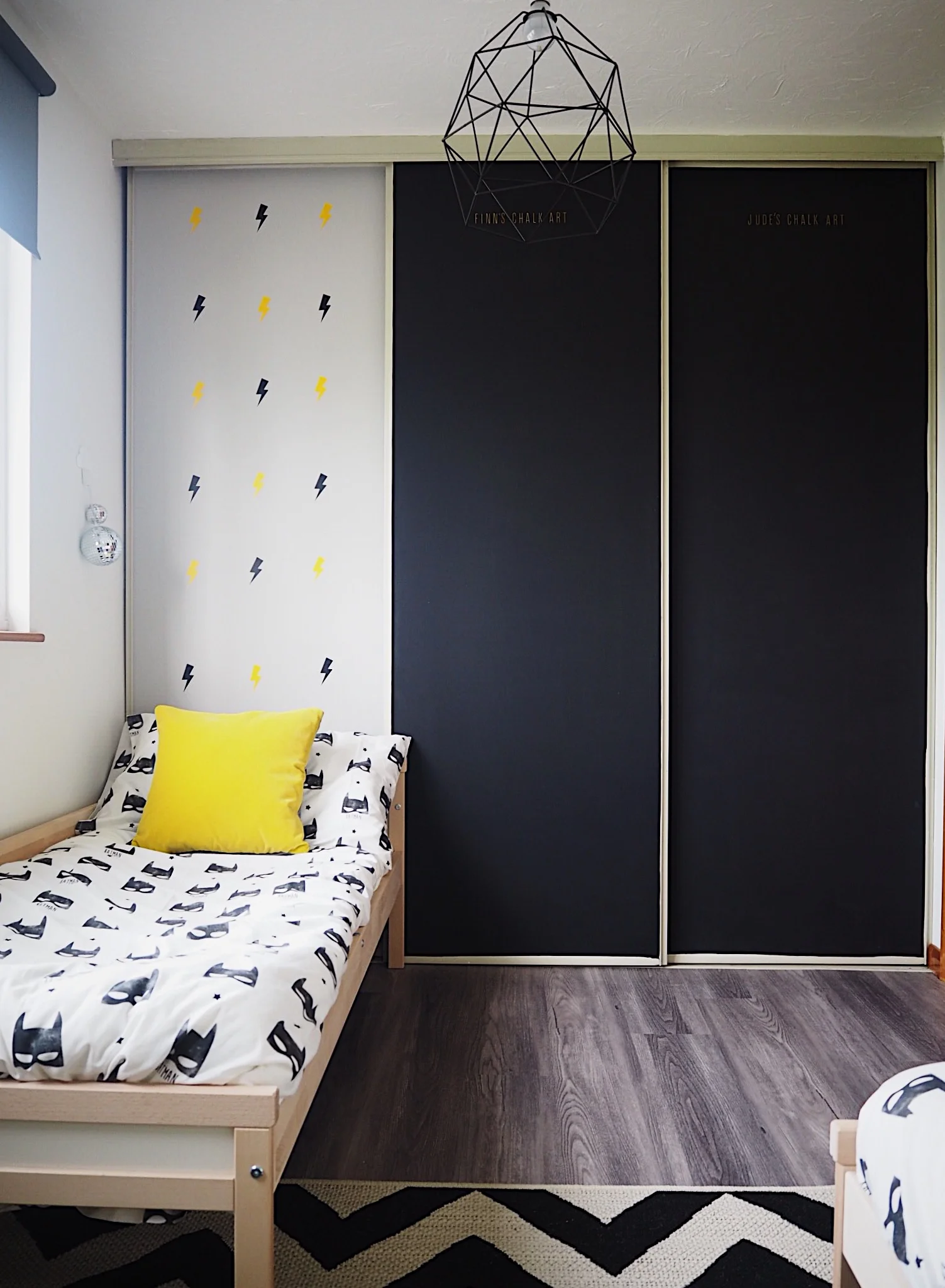
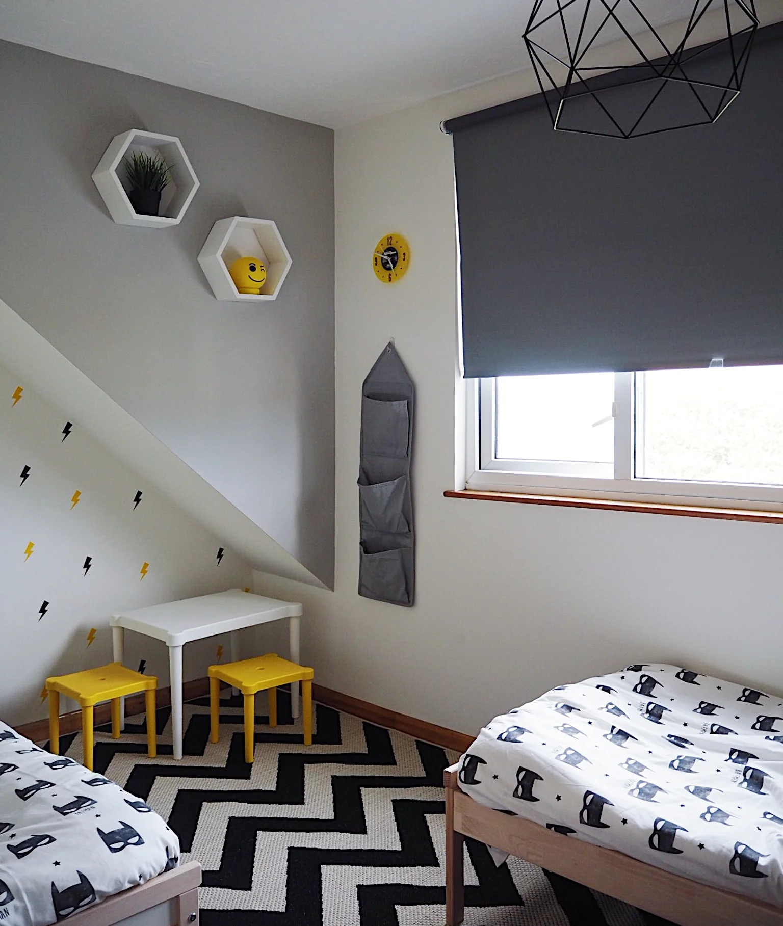
After the floor was laid and I had purchased all the items for the room, I went back to build the beds and furniture and style it. So - here is the room finished!:
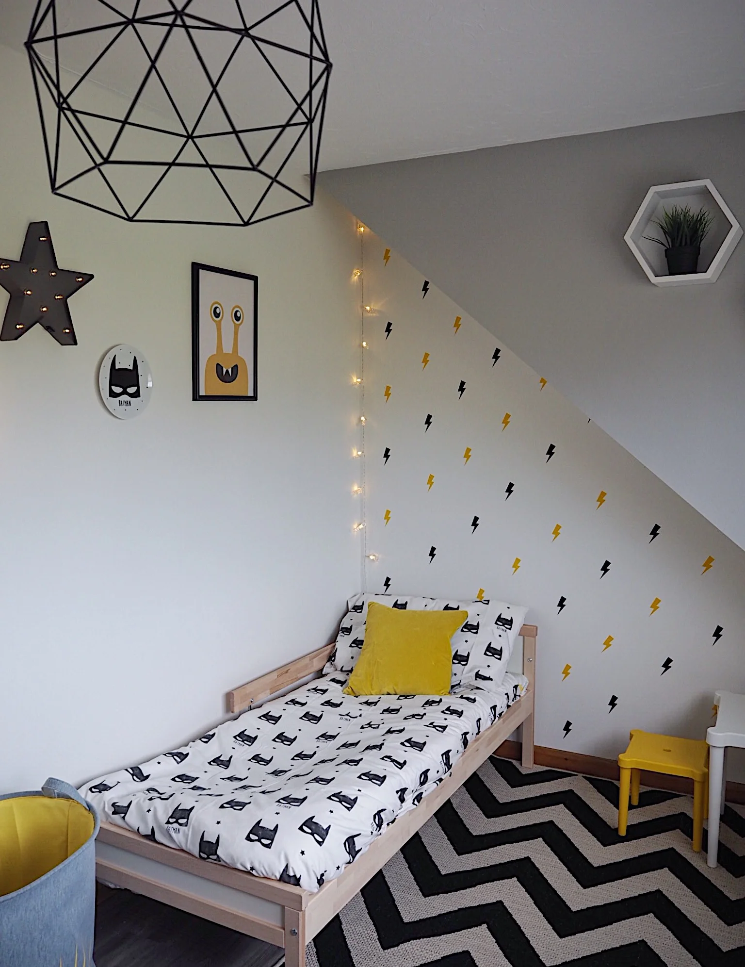
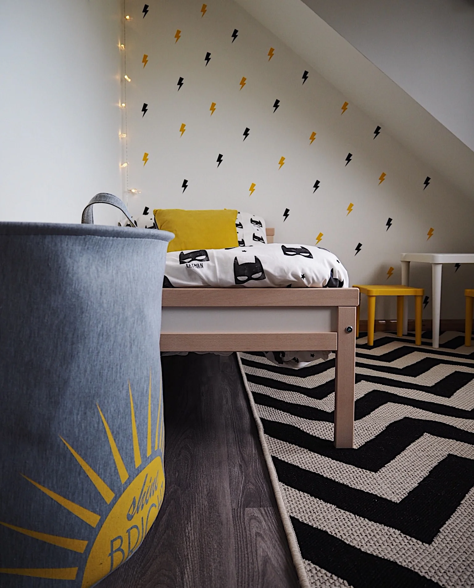
Originally I had planned on bunk beds for the room to create more floor space, yet due to the rooms small size and the slanted wall, they just did not work and felt overpowering. Instead, these two single child beds from Ikea worked really well. These bed frames are an absolute steal for £39 each - however - note the bed slats come as a separate product (madness), so if you ever buy these make sure you also purchase the separate slat for £10 and avoid another round trip to Ikea like I had to do! We decided to have one bed each end of the room to give either child their own defined area, and provide space for a small play area with a white table with two yellow stools.
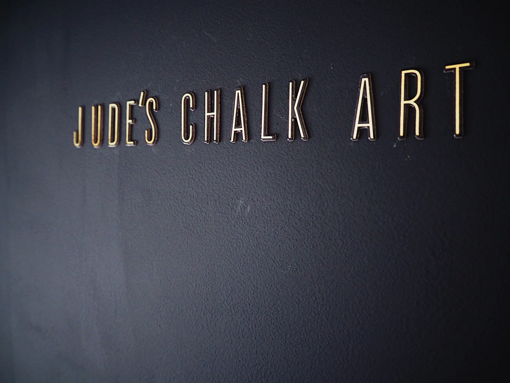
The chalkboard cupboard fronts I personalised for each child by adding their name in sticky letters from Hobbycraft. A hanging grey wall tidy from H&M Home provided space to accommodate coloured chalk and the board wipe when not in use.
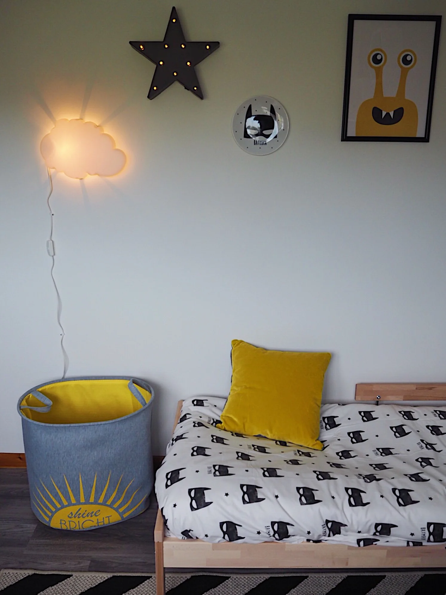
I love the block black and white pattern of the batman bedding, which came from H&M home. The British velvet yellow cushions with a grey back were a brilliant buy from a sourcing trip to Homesense.
To keep in with the yellow colour palette, I made the boys a wall clock from an old coloured vinyl 7" record.
The window was the perfect size for a ready-made blind from Ikea. Not only was the price great (£20!) it was child safe as it had no cord, rolling up when you pull the blind a certain angle. To be honest I was concerned about putting this blind up myself, thinking it would be quite a tricky DIY, but it was surprisingly easy to get right.
This toy storage basket was another great yellow and grey find from Homesense!
To make the room twinkle and sparkle in the evening for the boys, I added in a cloud night light, a battery operated LED star light, and fairy lights on pegs so the boys can clip their own choice of photos and pictures. The batman decorative plate is from H&M Home and the monster art is from Desenio.
The hexagonal shelves in white are from B&Q and really work against the grey slope wall. They are also a great way to display favourite toys.
The rug is from Dunelm, which was the chepest place I could find a large chevron rug. I replaced the existing light fitting and added in a basic drop down pendant and added a geometric lighshade from Ikea (I did also purchase a really cool large bulb for the light, but brought a screw bulb when the fitting I brought was T-bar! Rookie mistake! So there is just a basic bulb in these photos as I took them before the bulb was switched over.)
The total cost for the whole room revamp and everything in it was £600, which I think was pretty good for a total room transformation for two children where everything is brand new. My clients loved the room turnaround, and I've since been told that the boys (and mum) love it too!
For more decor ideas for kids bedrooms, why not follow my dedicated Pinterest board? I have also been nominated in the Home Improvement category in the 2017 Amara Interior Blog Awards, so if you enjoyed this post, please would you be so kind to give me a vote??

