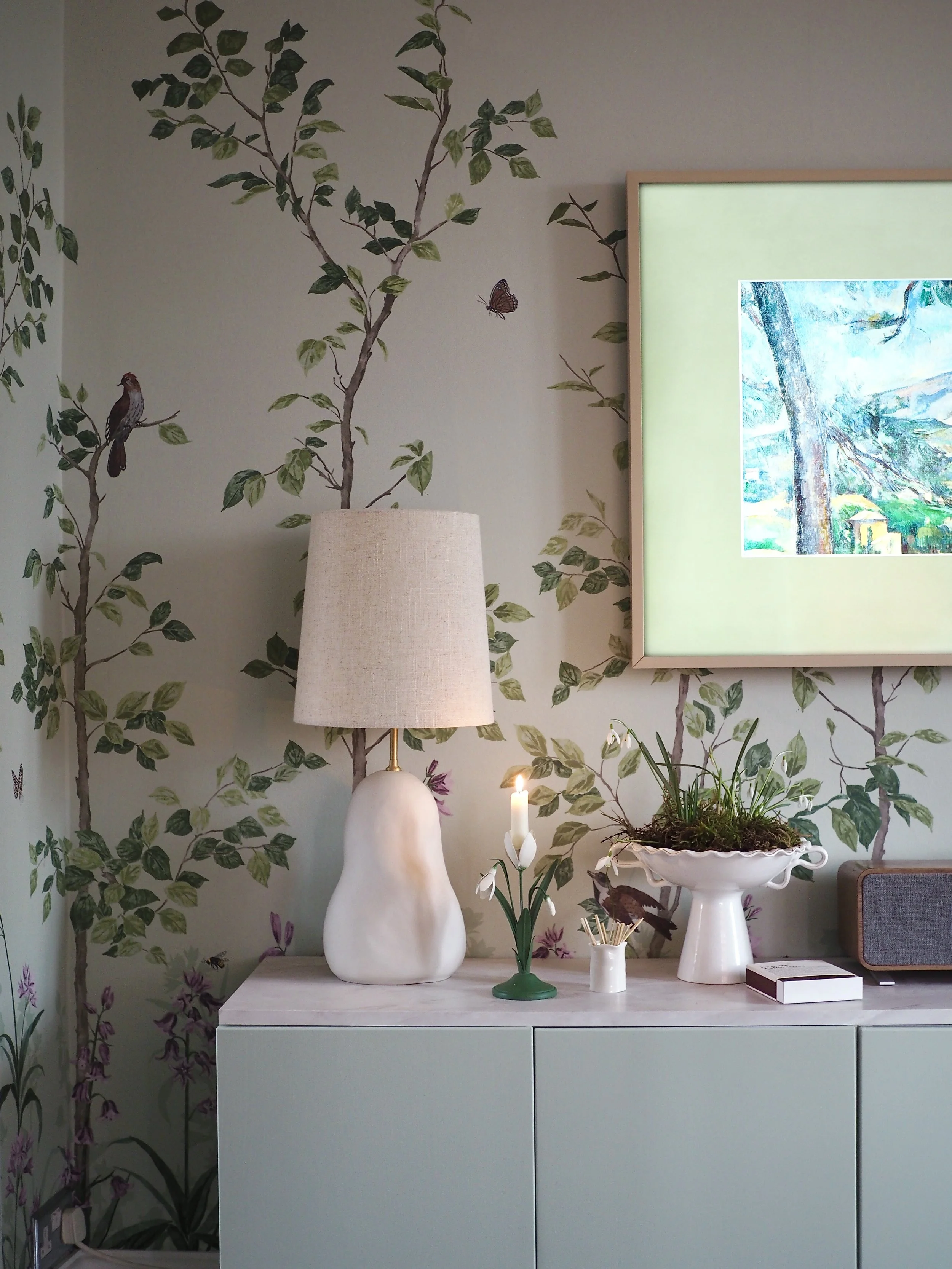
How I Created A Sophisticated Living Room Using Green Botanical Wallpaper
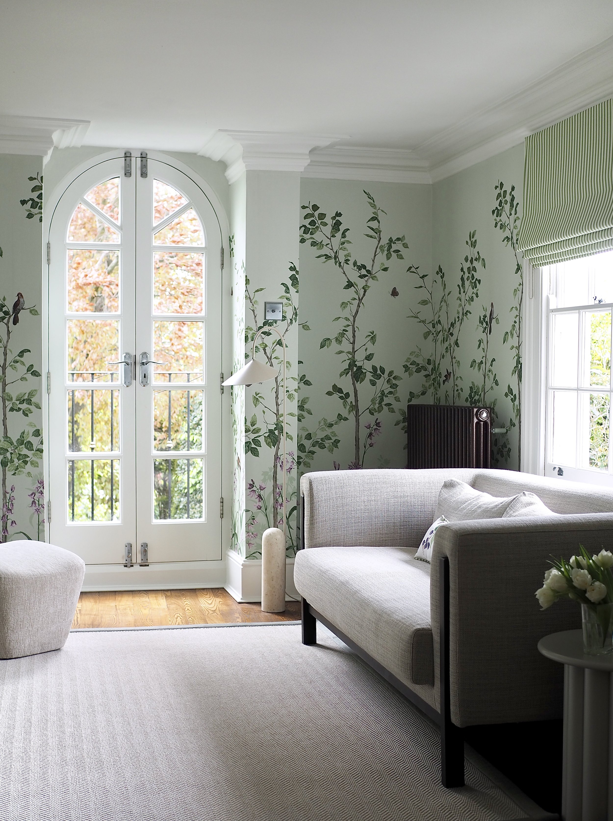
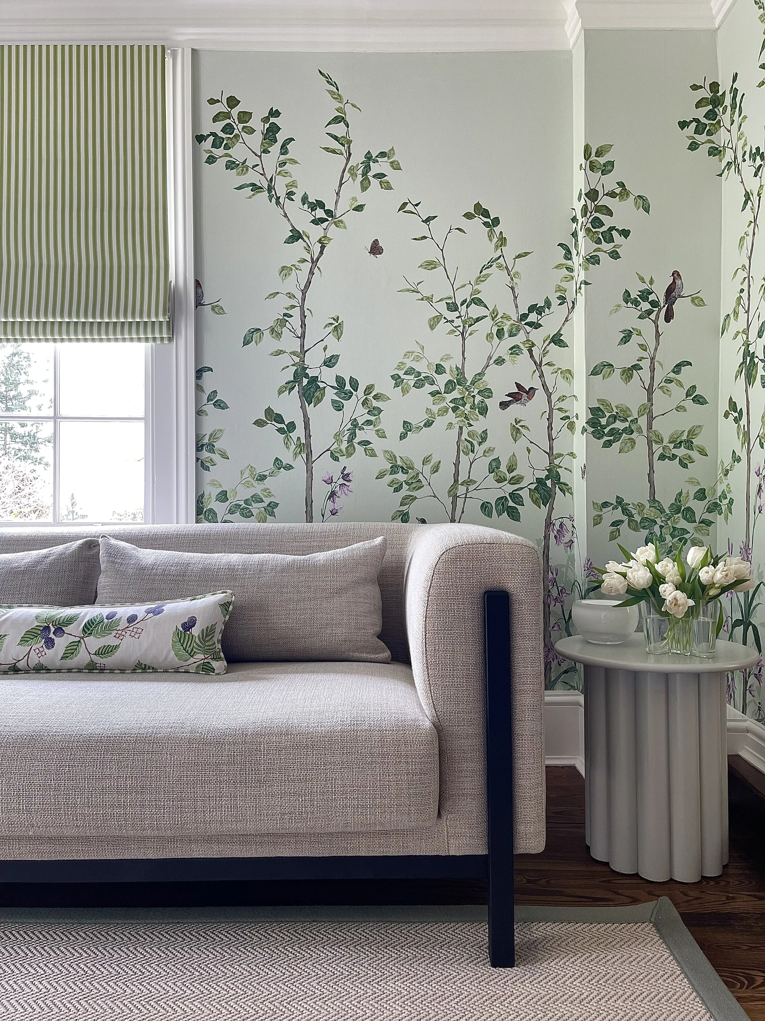
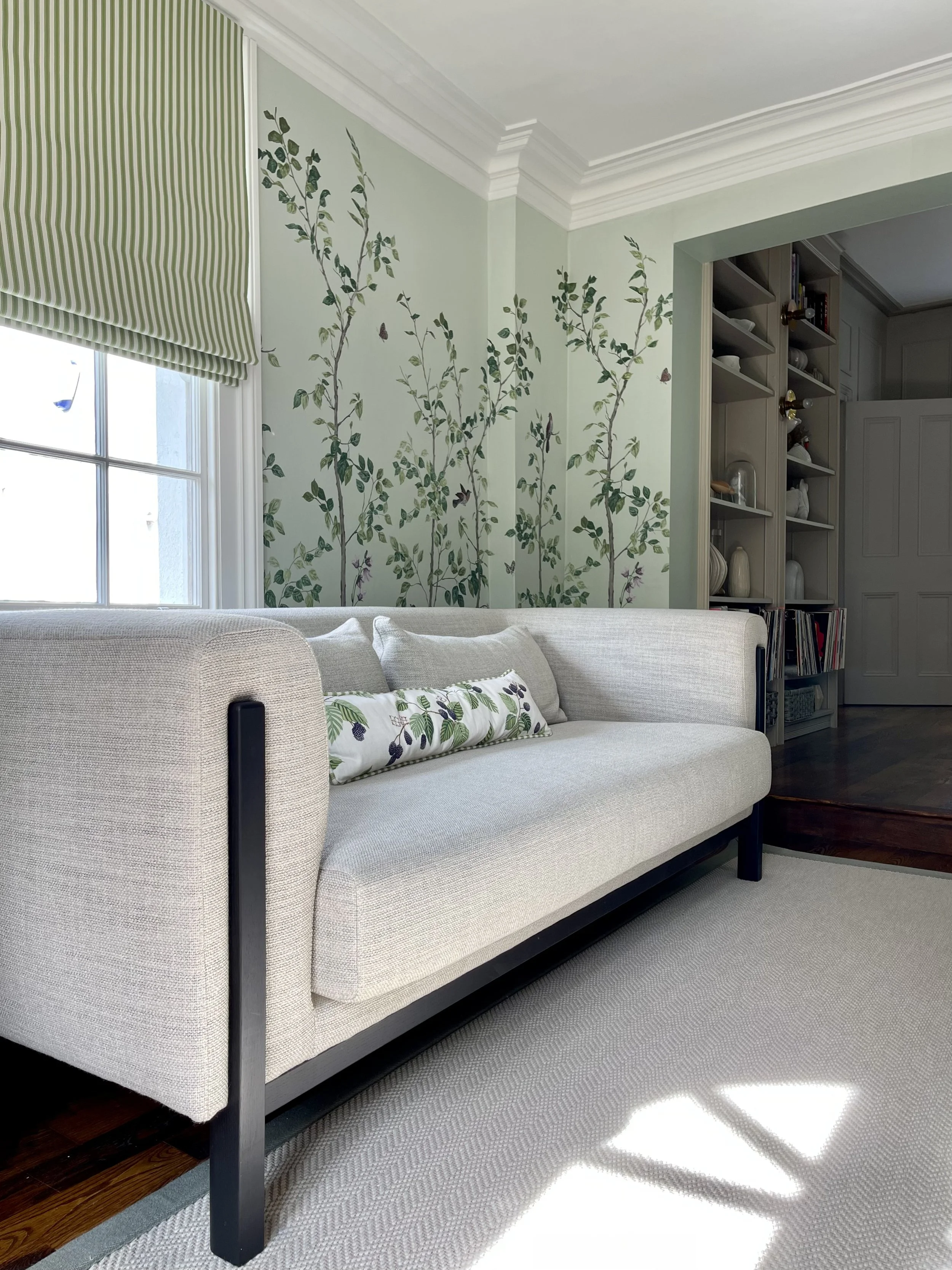
My living room needed a refresh; it had been painted the same blue shade for a long time and the sofa and rug in the room were old, stained and miserable to look at! I’d been trying to decide just what to do with this space for a good while - I still loved the old wall colour (even if it was chipping and full of cracks), so I knew I needed something extra special to transform it to look completely different. Just before Christmas, I saw a social media post from paint and wallpaper brand Little Greene - a preview of one of the new nature-inspired botanical wallpapers that they then released in January. One paper in particular - Bird & Bluebell - had been created from remaining fragments of wallpaper found at Felbrigg Hall in Norfolk and featured birds, bees and butterflies set against a soft sage green background with lilac bluebells dotted around the base. As soon as I saw it, I instantly knew that this mural would elevate my living room to another level and in February, I set about refreshing the ceiling and all the woodwork before getting this mural pasted onto the walls.
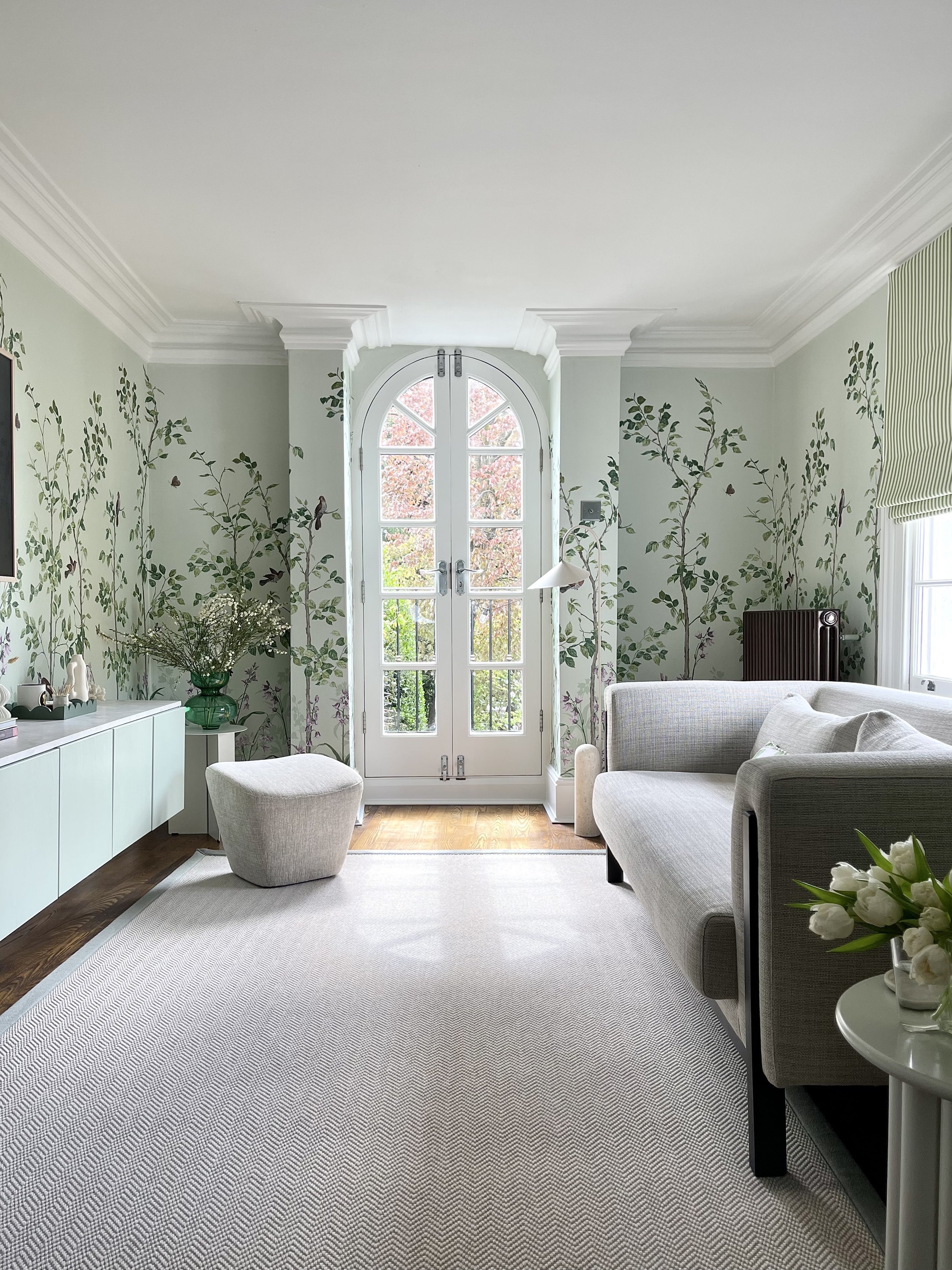
Originally, I was going to paint the balcony door, ceiling and window in a complementary green to the paper, but as soon as I started adding green to the ceiling I realised that the colour was distracting from the mural - the star of the show - and I reverted to the soft, shadow white of Slaked Lime instead. This crisp white gave a clean, fresh feeling to the previously tired room and instantly the space looked 100 times better. In the end, I only used a green selected from the Little Greene colour scales chart to paint the wall-hung TV unit doors and the dividing area between the living space and the sitting room.
Once the wallpaper was up, it was so impactful I decided to choose neutral furniture and furnishings as I’m not a maximalist and I don’t like too much going on so the eye cannot focus. I worked with Fibre Flooring (who I previously collaborated with in my home office) to create a bespoke rug in my chosen dimensions and selected a simple herringbone pattern (Chalk) for the surface area, edged with a soft green border (in Lichen).
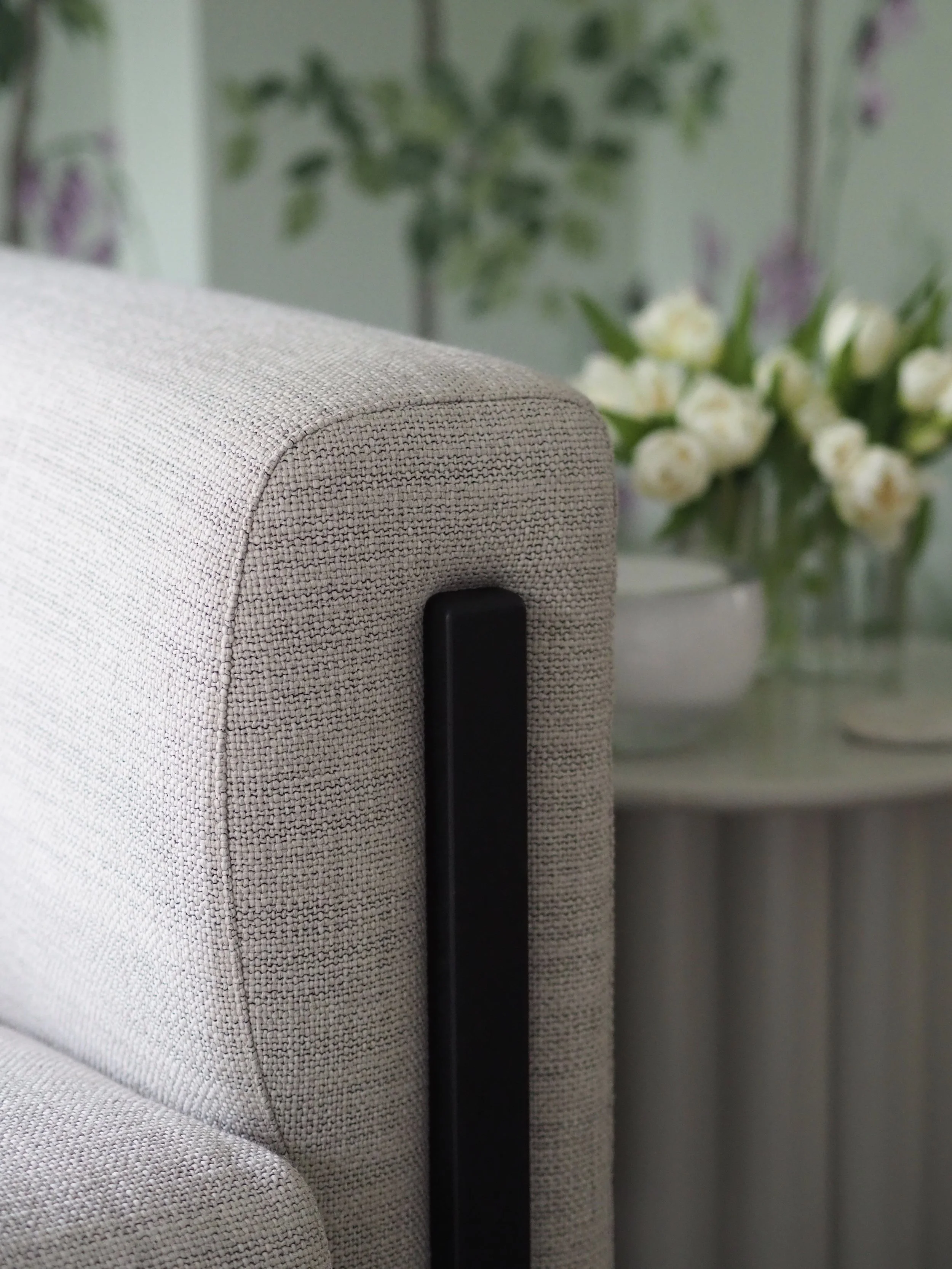
I had long lusted after the Heal’s Massimo sofa - having included it in a round-up of my favourite modern sofas when I initially started the long sofa search. Our living room has difficult proportions and I wanted something stylish but comfy that didn’t block the window and fitted alongside the radiator hung on that side of the room. I chose Tundra Texture fabric as it felt really thick and durable when I looked at it in the Heal’s showroom, along with accompanying black feet which escalate up onto the front of the sofa arms. I always panic when it comes to choosing a sofa as I feel like it’s really hard to visualise what they will look like once in the room, but I need not have worried - I am so happy with the style of it and the incredible quality of the 3 seater.
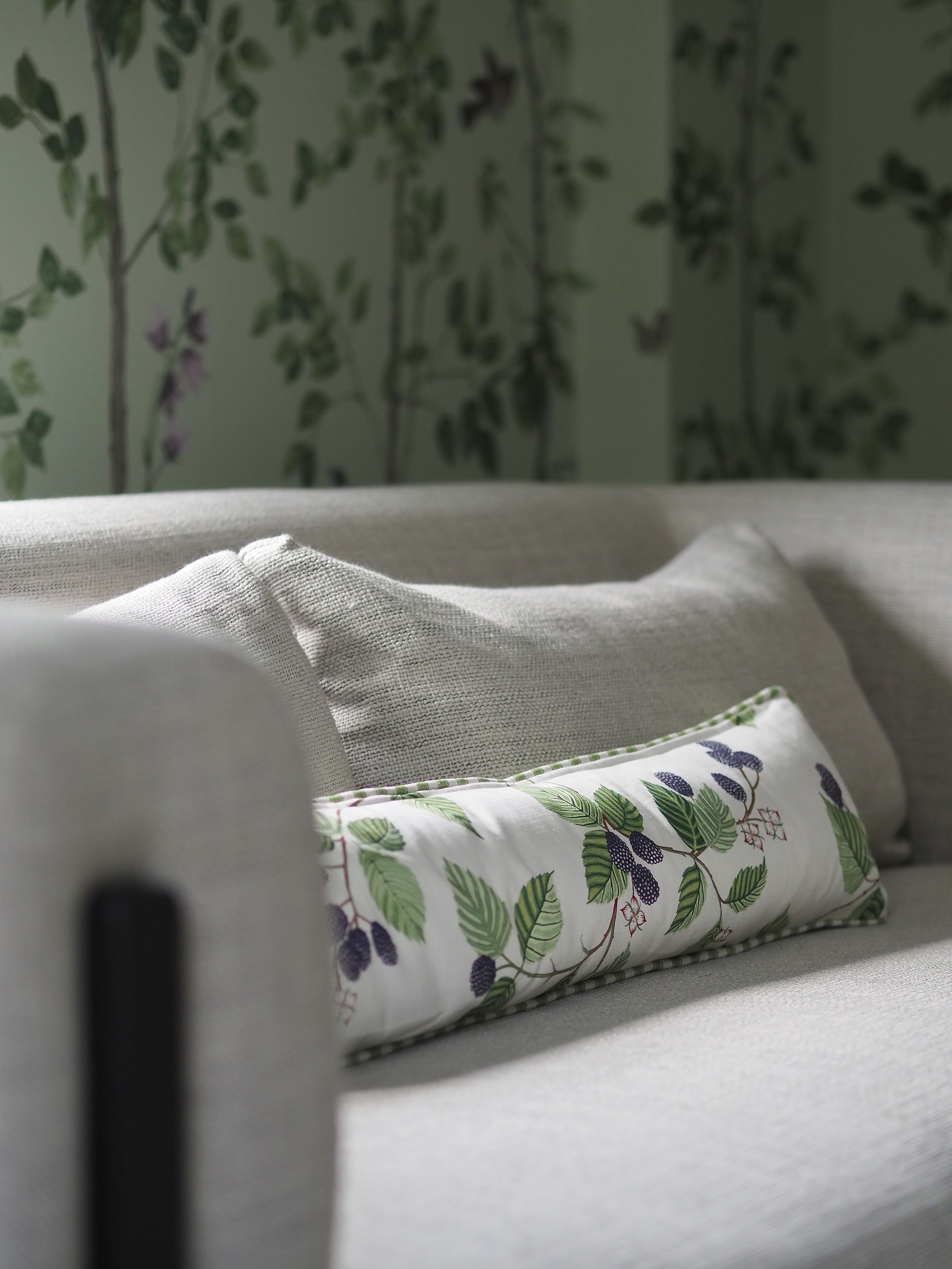
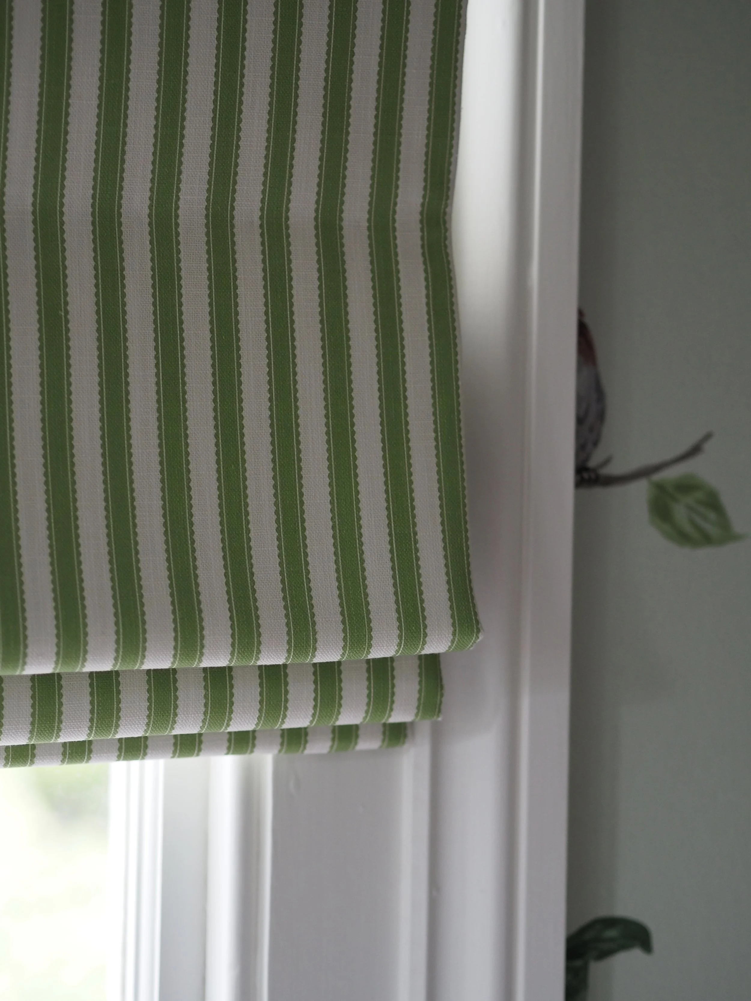
After inserting two neutral pieces, I decided it was time to start layering in a bit more pattern and colour again. I saw the new Sanderson Arboretum collection at London Design Week and I picked out two fabrics - Pinetum Stripe in Sap Green and Rubus in Blackberry - to have made into a Roman blind and a bolster cushion for the sofa.
Everything else in the room I brought in from other areas of the house, but I do keep on eyeing up green accessories that I will add in over time!
What do you think of my green botanical makeover? Let me know in the comments!
Please note that while all items featured in this blog post were my own personal choice and preference, some items were kindly supplied as PR products in exchange for some coverage over on my social media channels.
