Painting My Home Office a Dark Colour: 5 Tips I Followed To Stop the Room Feeling Small
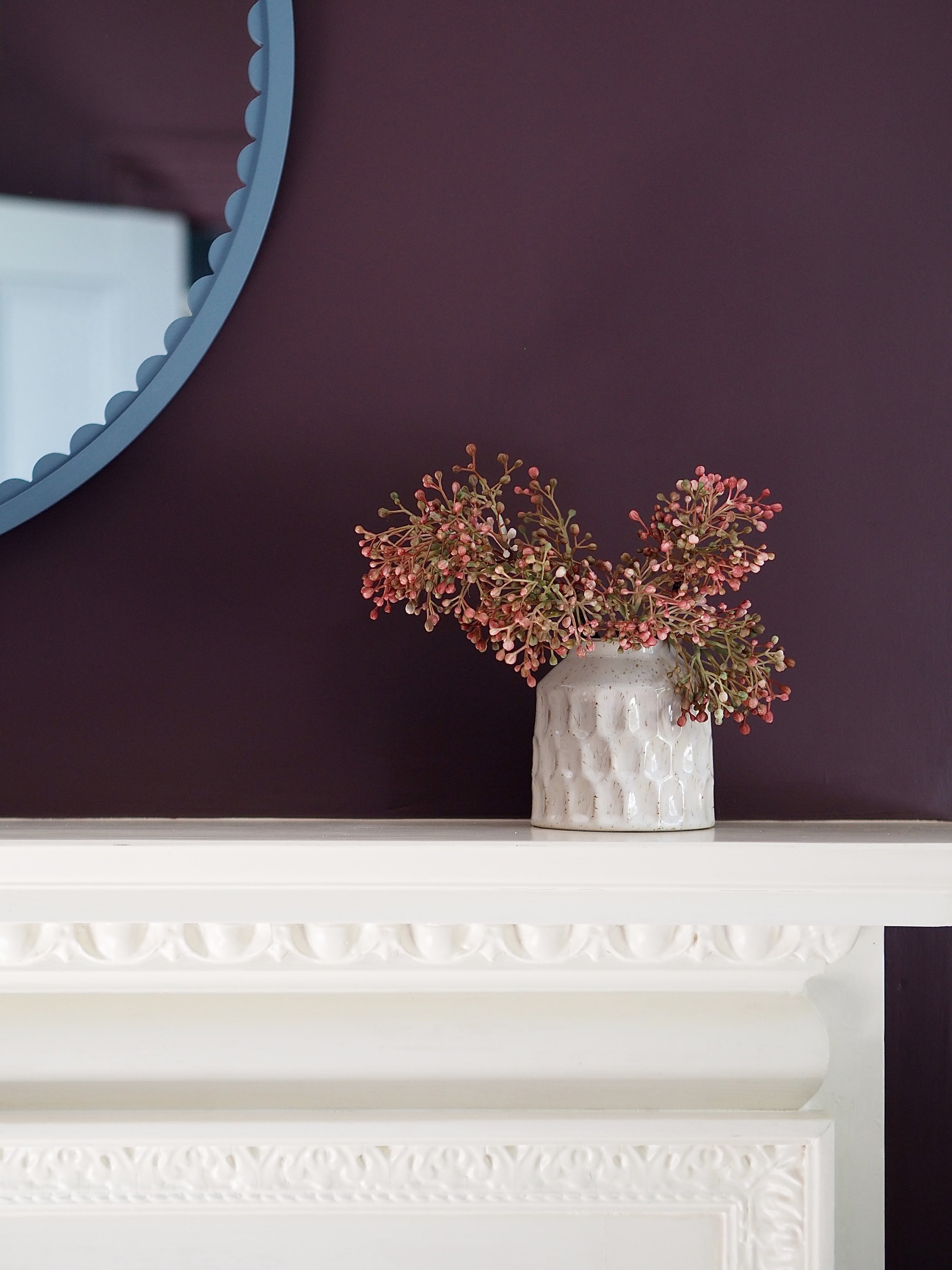
I’ve been really captivated by brown interiors recently. I’ve been filling up my ‘brown decor’ Pinterest board full of chocolate-coloured room schemes and when a friend sent me an image by Chris Loves Julia of their colour-drenched plummy brown bedroom, I knew I wanted to use a similar hue somewhere in my home. Luckily, UK high street brand Dunelm had just launched a very similar shade called ‘Mahogany Brown’ and I chose this paint colour to redecorate my husband’s home office.

Before the makeover, my husband’s office had turned into our ‘room of doom’. It was such a disaster, it became the room that any old thing got stored in because it couldn’t look any worse than it already did. While the room in itself was a stunning space featuring a large fireplace with an intricate surround, it was over-cluttered which made it impossible to clean, so it was a steady spiral of being tatty and tired.

How the room looked before.
My husband is a musician and before the pandemic, he used to tour a lot. In recent years, he mostly works at home, so more and more musical equipment kept coming into the room and it all got out of hand. It was definitely time for a re-set of this space, so we cleared everything out so that I could redesign and redecorate.
I previously painted the walls in this room a dark, inky blue. The colour was fine, but it didn’t really enhance the room in any way. The dark curtains alongside the dark walls made the room feel smaller than it was, while the clutter also contributed to limiting the room. This time, even though I was again going to use a darker hue in here, I implemented a few interior design tips that I had picked up in the last few years when using richer shades at home.
I painted the coving and the skating in the same brown hue to elongate the walls
Ever since I painted the coving and the skirting in my bedroom the same colour as the walls, I will never again leave these white. The wall height is shortened by keeping the coving the same colour as the ceiling (or having a strip of white at the bottom of your walls). By painting the walls, coving and woodwork all in the same hue, the walls automatically feel taller and you elongate the room. This is especially true when using darker paint colours. Darker shades will naturally feel more cocooning and less airy than neutral tones, but by elongating the walls using the same shade all the way down, the room will feel taller, giving the illusion of more space.

Painting in the coving the same colour as the walls.
Added soft furnishings in lighter tones
I added a light rug with neutral detailing and off-white curtains into the room to stop the dark walls from dominating. The brighter floor lifts the whole scheme, while the curtains balance everything out.
Hung a large mirror to bounce around light.
While this interior tip is quite well-known, it is true that large mirrors bounce around light so well and make everything brighter. I hung this mirror above the fireplace as a focal point, but hanging them directly opposite a window maximises their light projection.
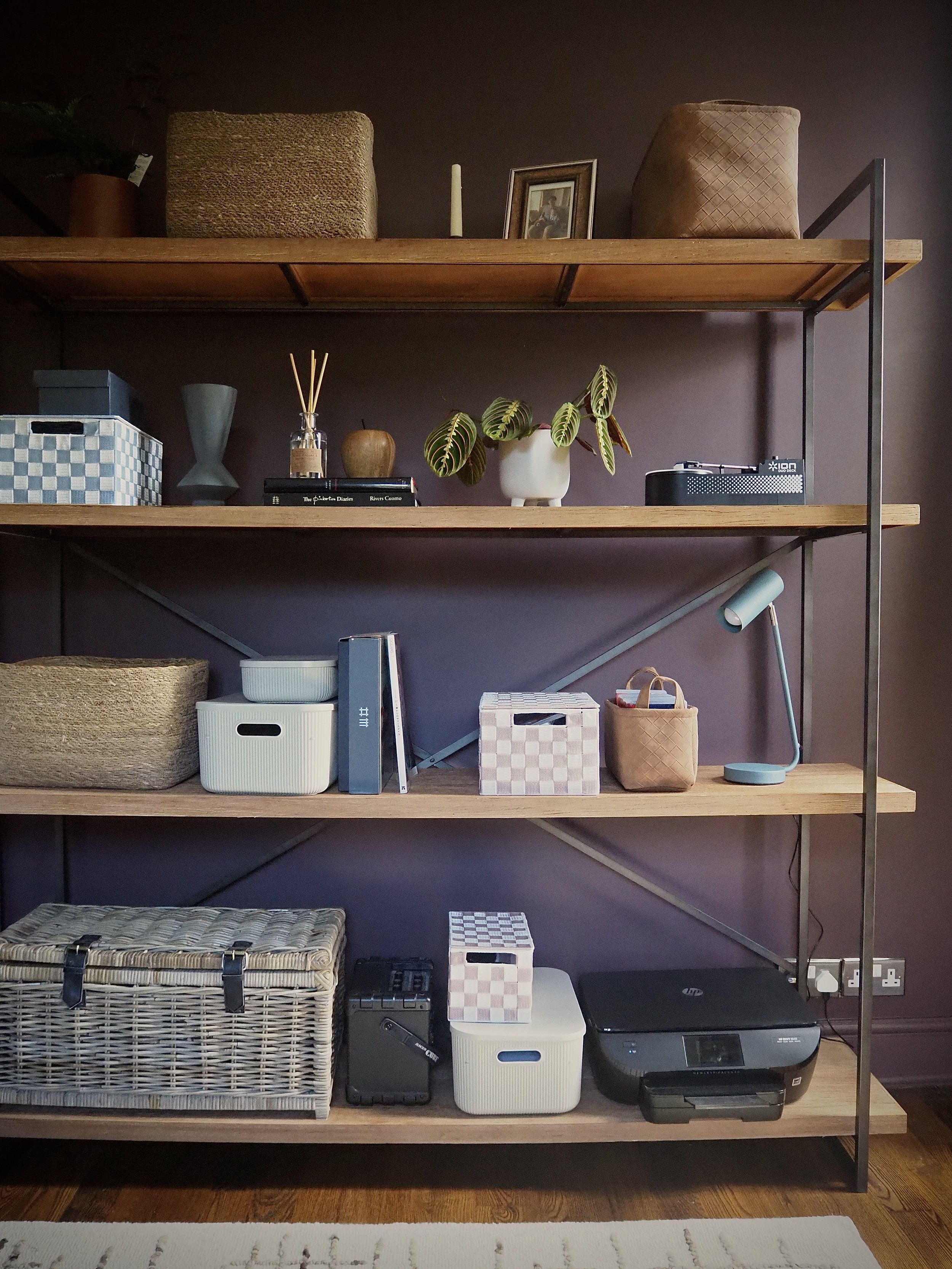
Storage is key to avoid clutter.
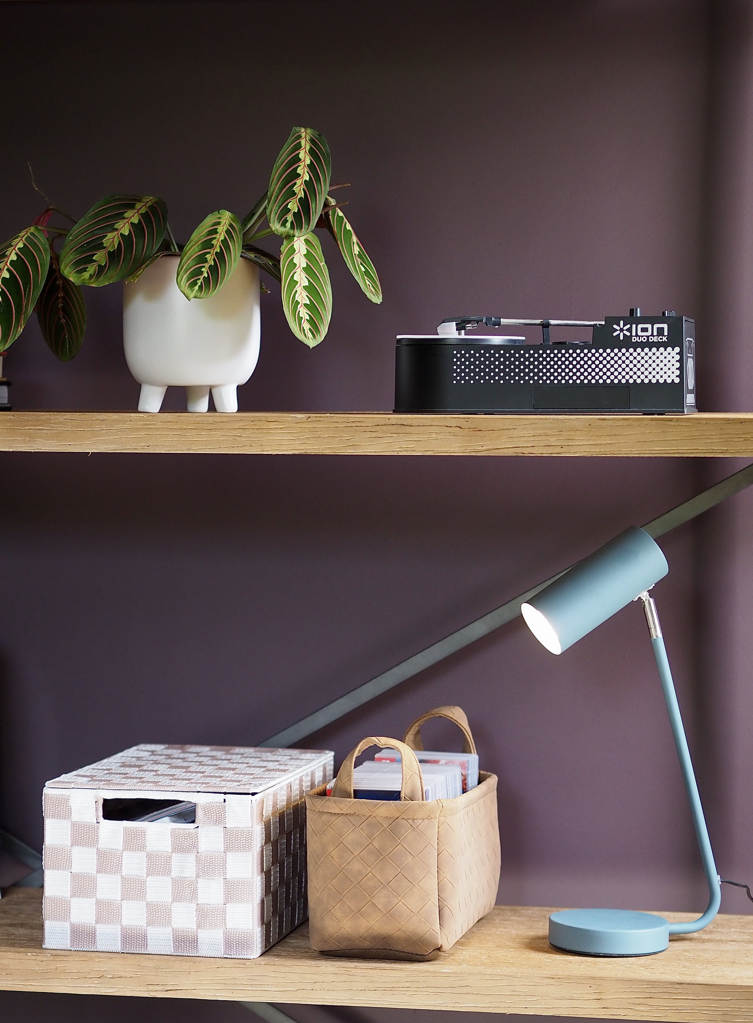
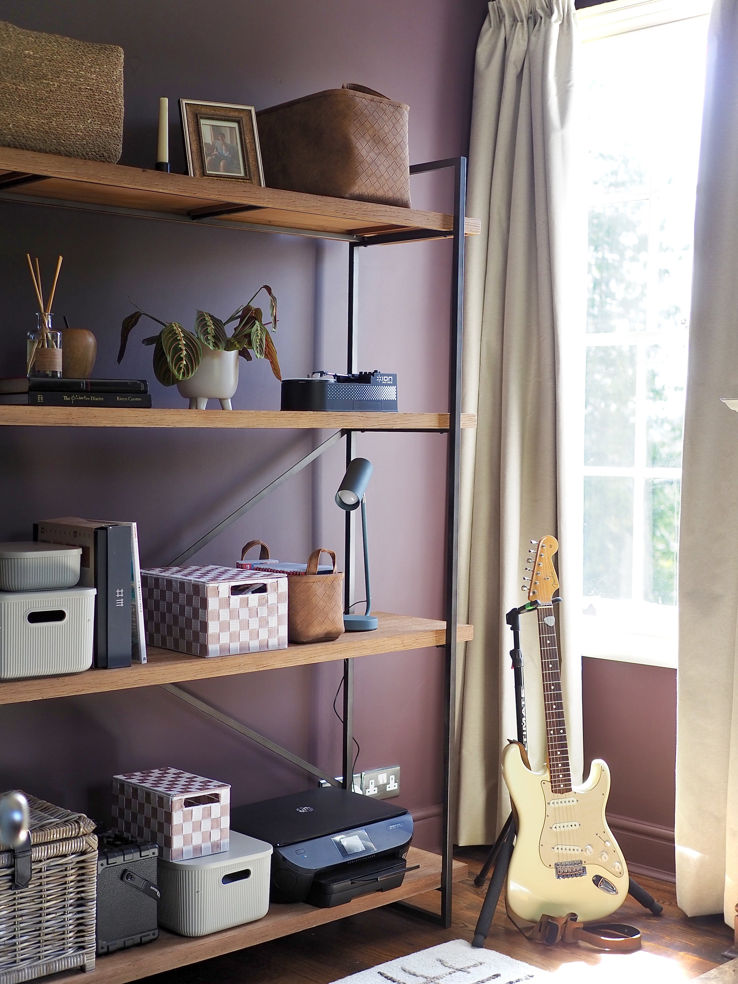
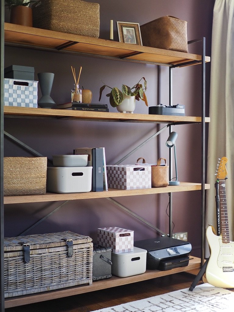
The biggest problem that we had with this room was clutter. It had really gotten out of hand and there was no storage space for anything, so stuff was all over the floor and piled high up on surface areas. This made the room hard to access and keep clean. It also made the room feel super small. This time, I prioritised storage in this room and invested in this huge industrial-style Beacon shelving unit. This unit could take loads of storage boxes and baskets where everything could be grouped, categorised and organised. As the metal frame of the unit is slim, it lets light and air travel around it so even though it is large, it doesn’t feel bulky in the room or like it takes up too much space. I balanced out all the storage with a few decorative items like houseplants and a room diffuser.
Added vibrant pops to make the room feel modern rather than stuffy and traditional.
This room has traditional period features and painting it in a darker hue accentuates that. To keep the room modern and to make the most of a darker backdrop where colours will pop out against them, I added furniture and accessories in citrus yellow, orange and blue.