Chelsea Flower Show 2019: How The Show will Influence Home And Garden Trends Going Forward

For the past two days I have been in attendance at the Chelsea Flower Show: the world-renowned, quintessentially British, annual celebration of all things horticultural. It has been a delight. As a lover of colour and a pretty flower, there is nowhere better to soak-up a sunshine filled day. The show is also attended by the creative elite - from interior and furniture designers to actors and musicians - the show provides incredible inspiration and sows the seed (if you will) to many new designs and ideas. This year there were a few key themes, messages and colours which I think will infiltrate the way we design and style our homes, plus affect the purchases we make.

Read More

How To Make A Door Look Bigger With A Simple Paint Trick

Paint is a powerful tool. With paint, you can make a smaller room feel much larger just by choosing the right shade. You can also ‘hide’ ugly items such as radiators by painting them in the same colour as the wall behind it. In my hallway, I wanted the reverse side of my front door to feel much grander. It’s a beautiful door and I wanted to draw as much attention to it as possible! Apart from just painting it an attention-grabbing bight teal, I also tricked the eye into thinking it is bigger by painting over the door frame and onto the wall.

Read More

How To Make This Acrylic Tray

Clear acrylic or Perspex furniture and home accessories are brilliant if you want your room to feel spacious, uncluttered and airy. The fact that you can ‘see-through’ the piece means that it does not feel bulky or chunky in a space. In my new home office, the room is quite small and my new desk is so beautiful, the last thing I wanted to do was cover it up. I did, however, require a few organisational desk accessories, so decided to create this DIY acrylic tray.

Read More

The Ultimate Kitchen Inspo Pictures You Have To See: Pure Scandi Meets Murals Wallpapers

Two years ago I wrote a post on this blog all about a kitchen company who had blown me away when I had seen their kitchen unit drawer and door fronts used in projects across Pinterest and Instagram. I’d never seen anything like it - there were baby blue doors with polished gold handles, scalloped cloud-front patterns and deep green units teamed with gold metal splashbacks. The company was Naked Doors, a Norfolk based kitchen supplier and part of the Naked Kitchens group, who have since been featured in every decent newspaper ‘Home’ supplement and interiors magazine going. Yet, it wasn’t just the interesting designs and coloured fronts which made Naked Doors so appealing, it was the fact that they sold good quality replacement cabinet doors and drawer fronts for existing kitchen units (or, off the shelf IKEA unit carcasses). You didn’t have to purchase a whole new kitchen to achieve the very desirable, contemporary kitchen you’d pinned to your ‘kitchen inspo’ board.

Read More

Hallway Makeover Reveal With M&L Paints

This hallway reveal is really a tale of two designs. The upstairs landing is pretty, pink and floral as planned (you can read more about that and see all the ‘before’ pictures here). While the the lower floors are more contemporary and the colour choices were only decided on halfway through the decorating process. For this project I decided that the skirting, doors, windows and coving would be made key features using colour, while the walls would simply be the backdrop. This is in reverse to how the hallway looked before, which was the traditional ‘colour on the walls + white woodwork’ look. The main aim of this makeover was to add some much needed interest to the space and while I had considered adding mouldings and panelling, I felt it would be too imposing on the narrow area. The period doors and and original coving were great features, so it was these that were to ‘sing’.

Read More

Home Office Mini Makeover With West Elm

I’m delighted to reveal my mini home office makever today on the blog! On my previous post, I talked about how the shared home office I had with my husband wasn’t panning out, while at the same time, the ‘guest room’ in the basement was hardly being used and had turned into a dumping ground. With the help of some amazing and generous companies, especially West Elm, I have now turned this space into my own home office and I LOVE IT!!

Read More

How To Make These Easter Tree 3D Egg Decorations

In recent years I have really taken to having a little bit of Easter decor around the house to celebrate the season. Rather than a lot of Easter bunnies and chicks, I prefer to create something a bit more grown up to place in the window. These 3D paper decorations are cheap and easy to make, plus they are really effective when hung on blossom branches (real or faux) to create a decorative spring scheme in the home.

Read More

Embracing Pinks And Florals: My Plans For A Hallway Update In My Home

So it might seem like it’s all talk and no action round these parts - my last post was on a home office and en-suite makeover yet to be revealed - but sometimes projects and opportunities just overlap! Today, I want to talk about my plans for a makeover to my hallway, which has never had much attention and has therefore never really worked. As I have decorated around the house, the hallway has become more of an issue as this is the space that flows between each of these new rooms. Each room feels unrelated and disconnected from the hall, when really it should be an introduction to each separate space.

Read More

My Plans For A Home Office Mini Makeover

Two years ago I did a ‘before and after’ blog post on creating a home office that both my husband and myself were going to share. As a musician, he was often away travelling and I had only just started this blog, so just blogged as and when for fun. Fast forward two years, he is working from home most of the year and I am running a design consultation business alongside this blog. The shared space was just not working for us anymore. He filled the room with musical paraphernalia and it became a shotgun game to who got to use the desk. I started to think we might be outgrowing the house, when it occurred to me that we had the space, we just were not using it efficiently.

Read More

15 Of The Best new Homeware Products In The Spring/Summer 2019 Collections

March is usually the month when new pieces from the spring/summer home collections start to become available online or in-store to purchase. I’ve seen quite a few interior bits and bobs this season that I’ve really liked, so I thought I would share some of those ‘must-have’ items out for SS19….

Read More

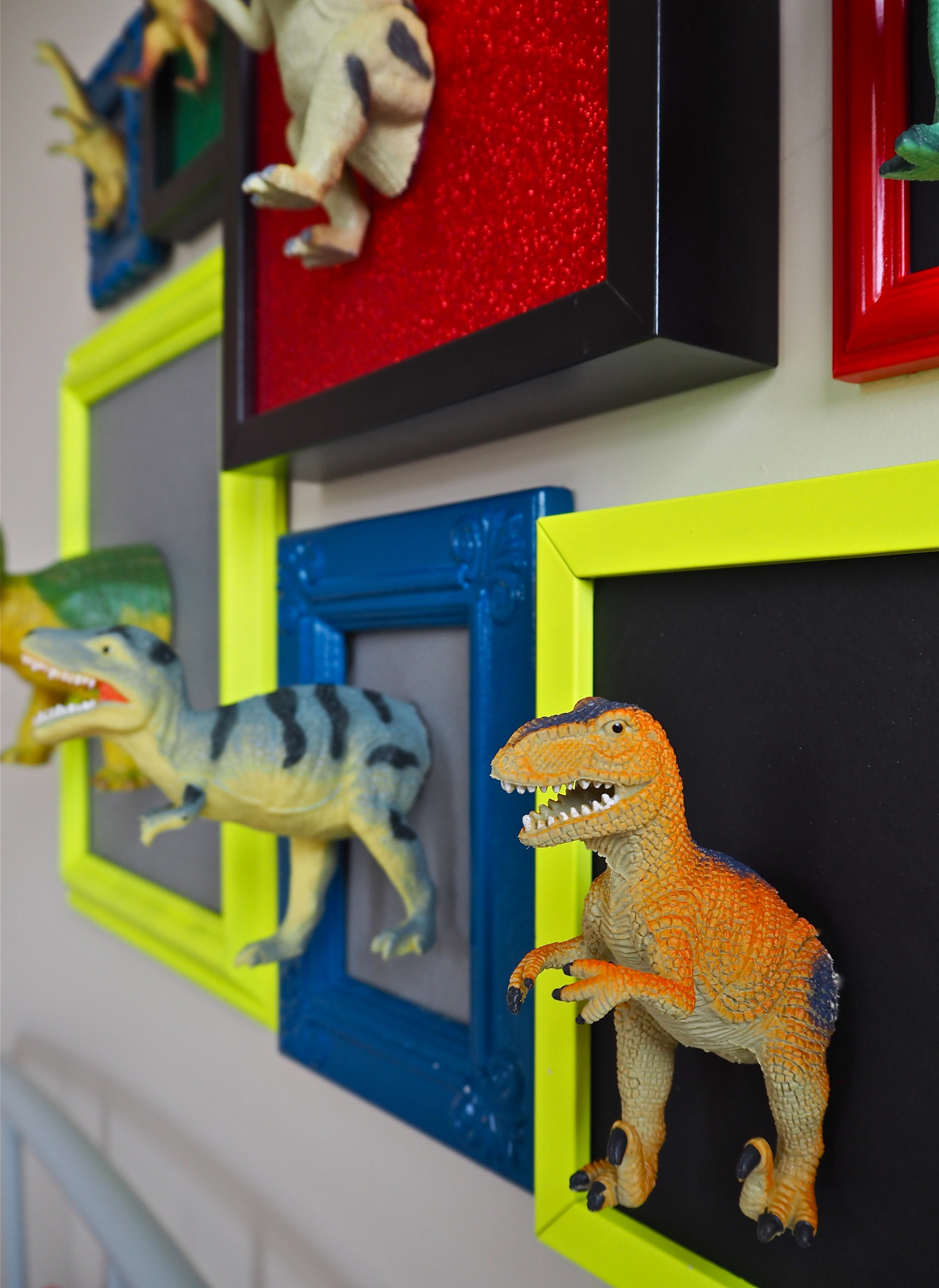
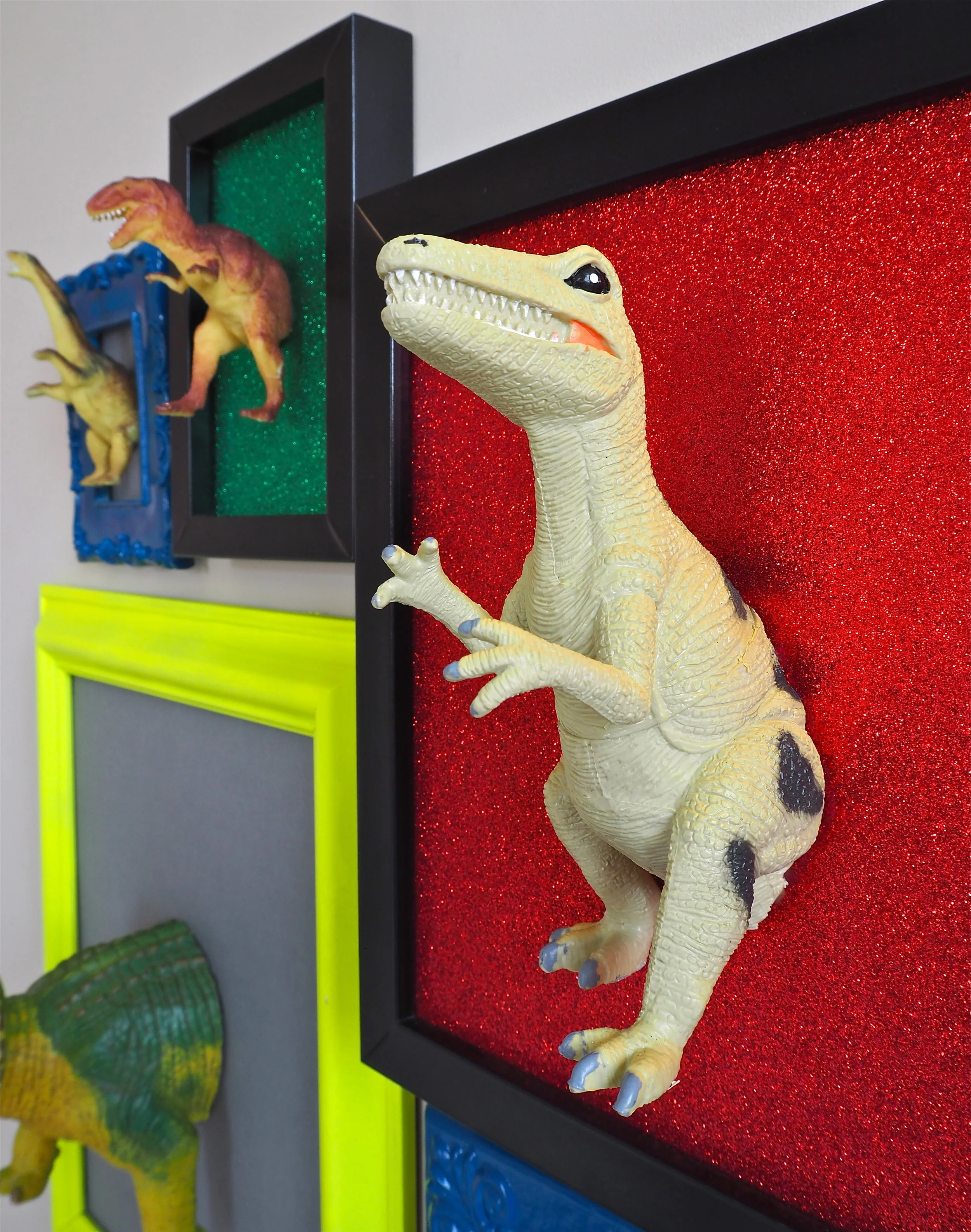
How To DIY This 3D Dinosaur Art Gallery Wall


3d dinosaur art with gorilla glue

How to make this 3D Dinosaur art for a kids’ room using plastic dinosaurs and old pictures frames.

3d dinosaur art with gorilla glue

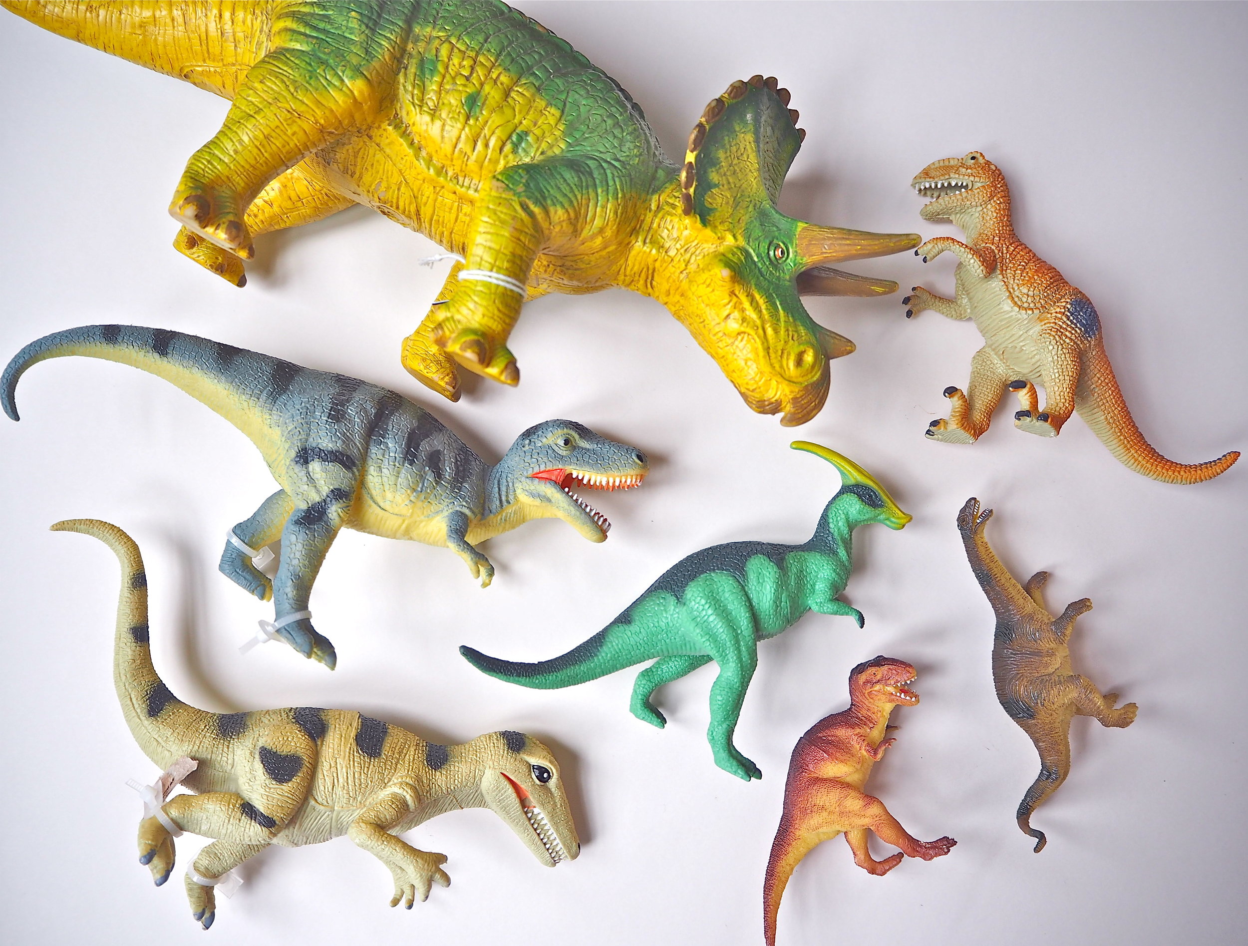
If you do not have any dinosaur figures to hand, used plastic dinosaurs are ten a penny in charity shops and car boot sales across the country. In fact, I picked up most of the dinosaurs used in this DIY in the first charity shop I popped into on my local high street! While I was in there I also sourced a collection of frames in different shapes and sizes. I just removed the old artwork and cleaned up the frames they came in.

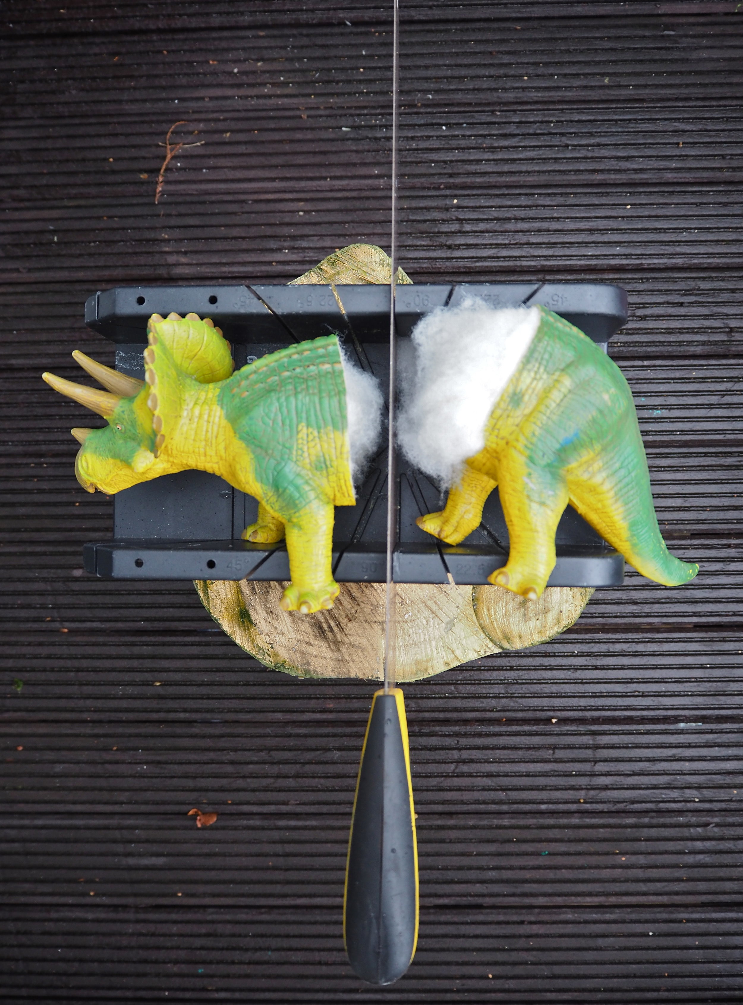
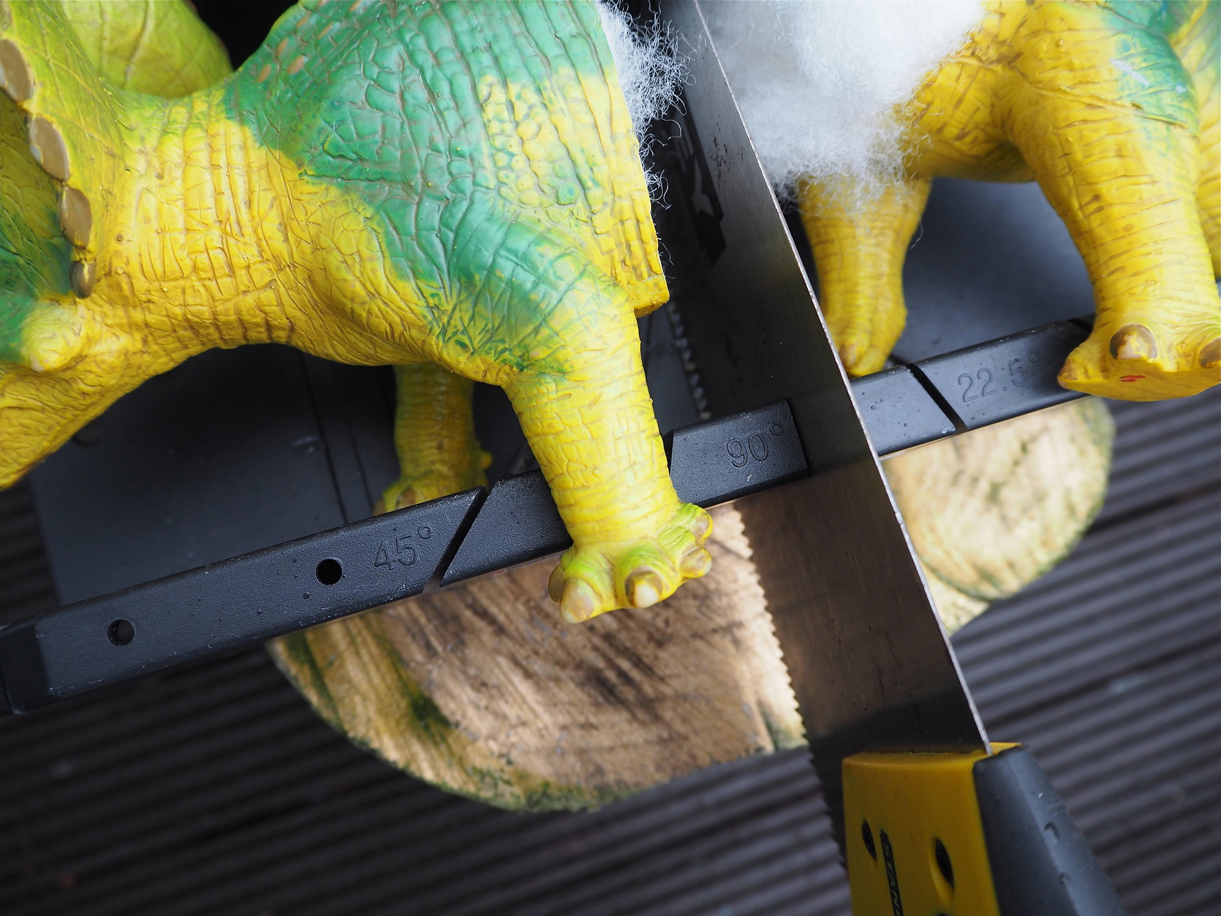
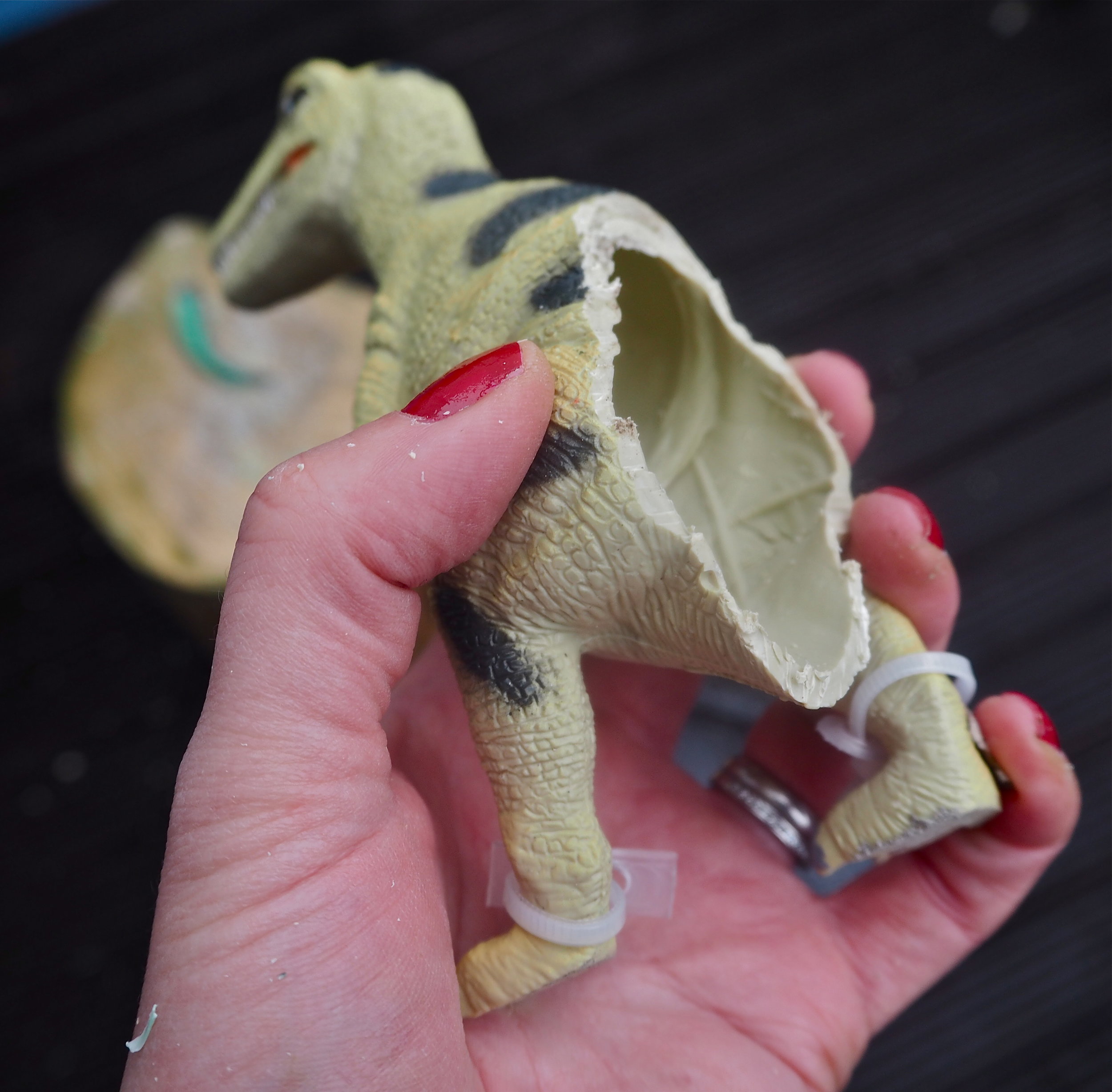
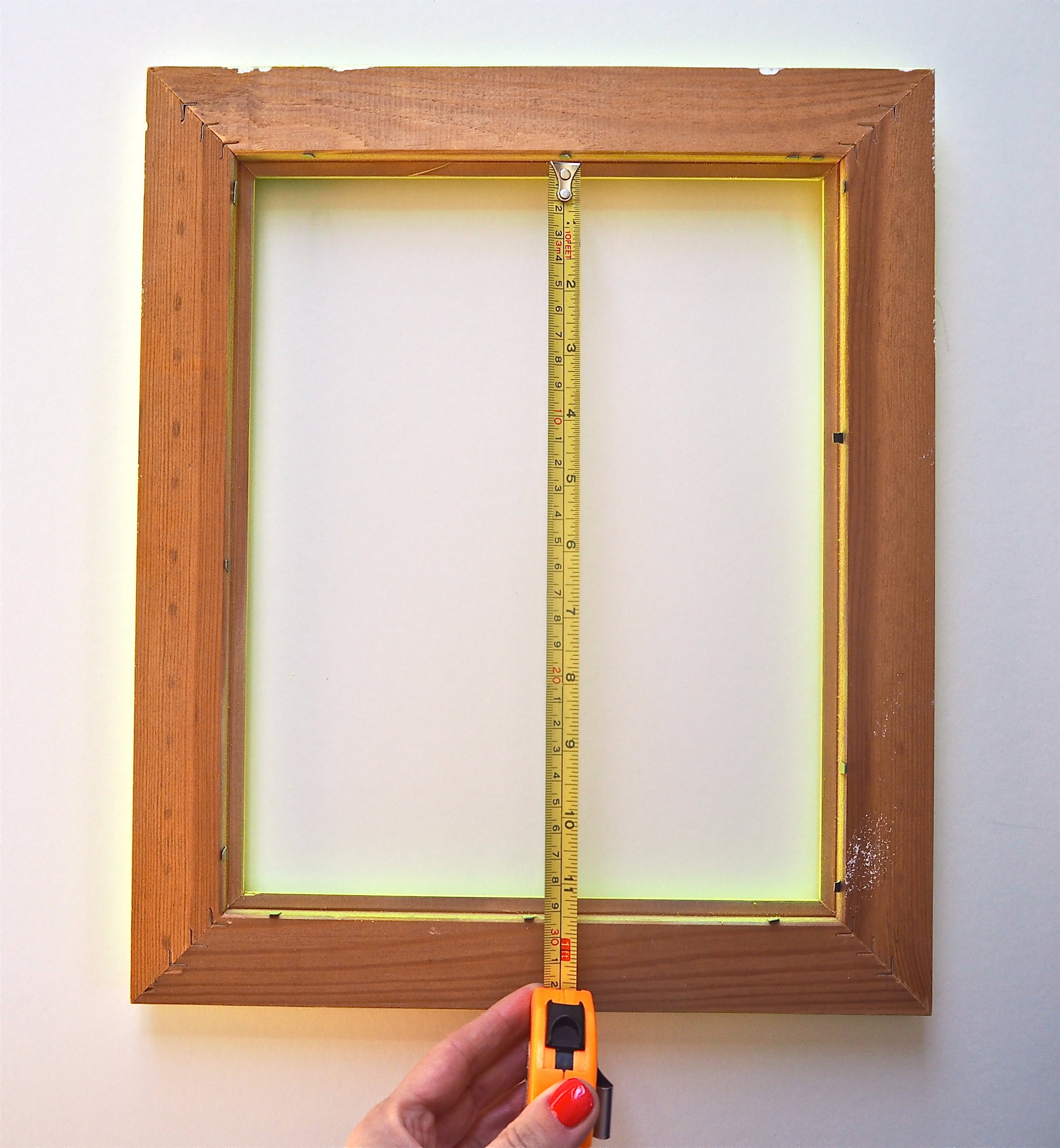
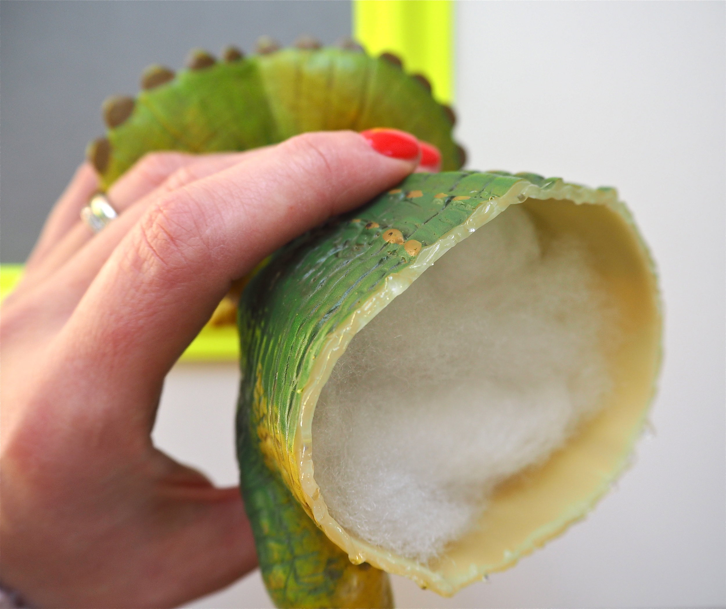
The first step in creating this DIY is to dispose of the back end of the dinosaur! I took each dinosaur and worked out what I wanted to ‘pop’ out of the frame and what I could get rid of from the back. I mostly kept all legs but got rid of the tail. You do not want your dinosaur to be too top-heavy, but if it is missing a leg it might look strange. Work out your cutting point and then slice him in two using a handsaw. I used a mitre box so that I could make a nice clean, straight chop. However, a mitre box is not essential if you have a good grip.

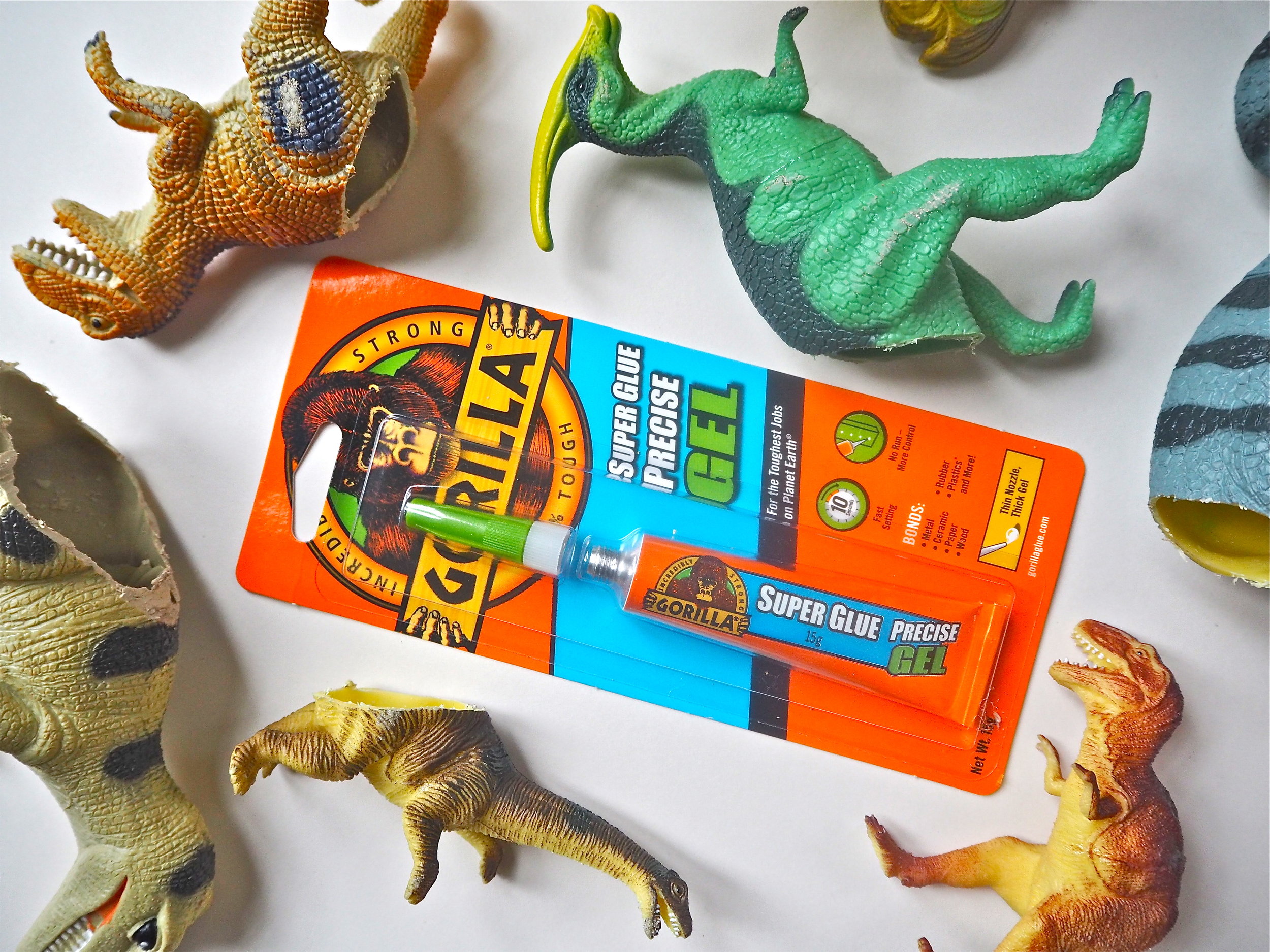
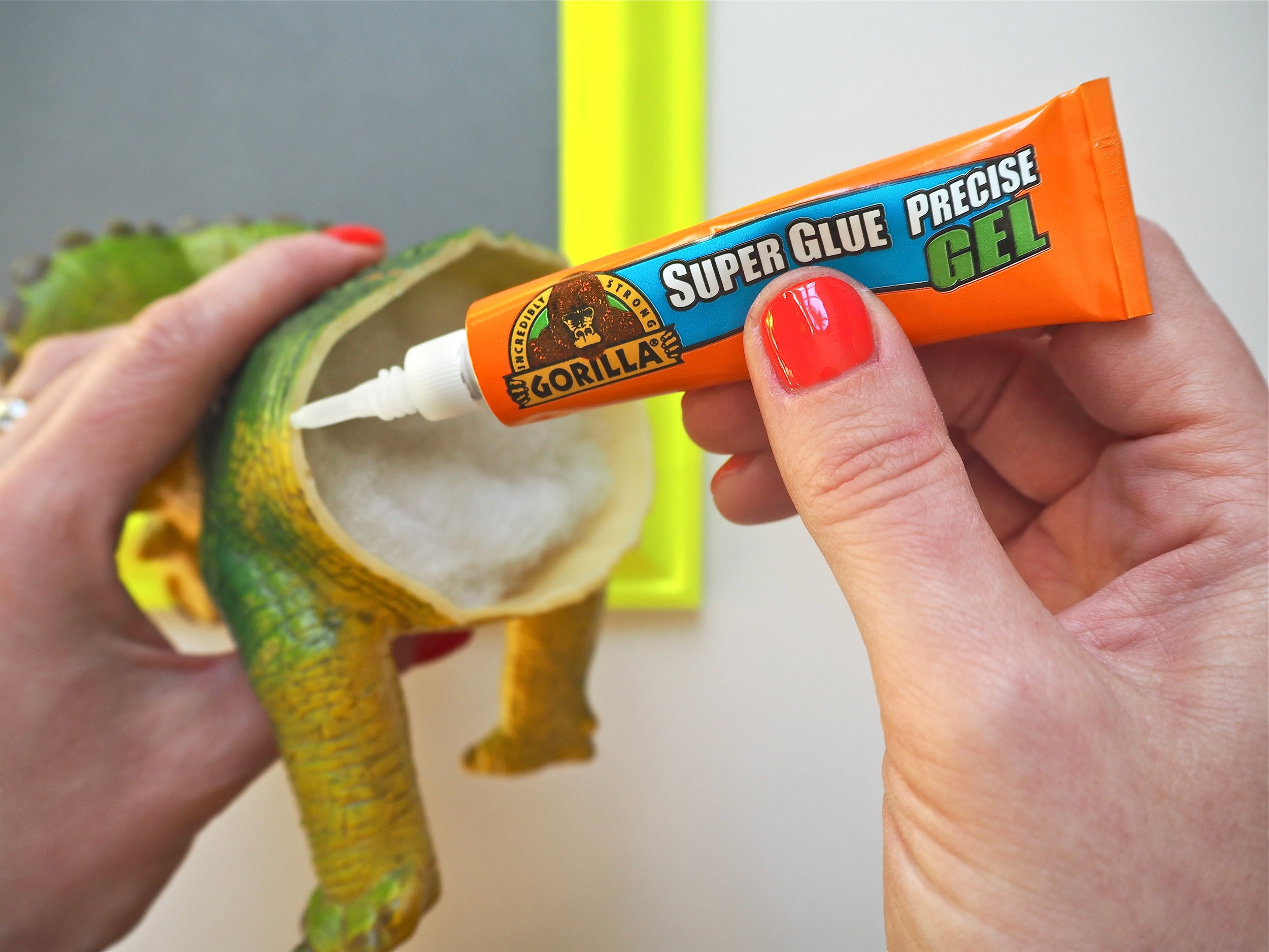
Once you’ve cut your dinosaurs you’ll find that in most instances your dinosaur is hollow and the sawed plastic rim you need to glue onto your mount inside the frame is quite thin. This is why I chose to use Gorilla Super Glue Precise Gel for this DIY. The gel can be applied in a very precise manner with the thin nozzle. As the glue is a thick gel it will not run, meaning that I can apply it to the cut outline easily without mess. The Precise Gel bonds metal, wood, ceramics, paper, rubber and plastics*. As my dinosaurs are a mix of rubber and plastic to be secured to the card, I knew this was the perfect product to use as they would join successfully.

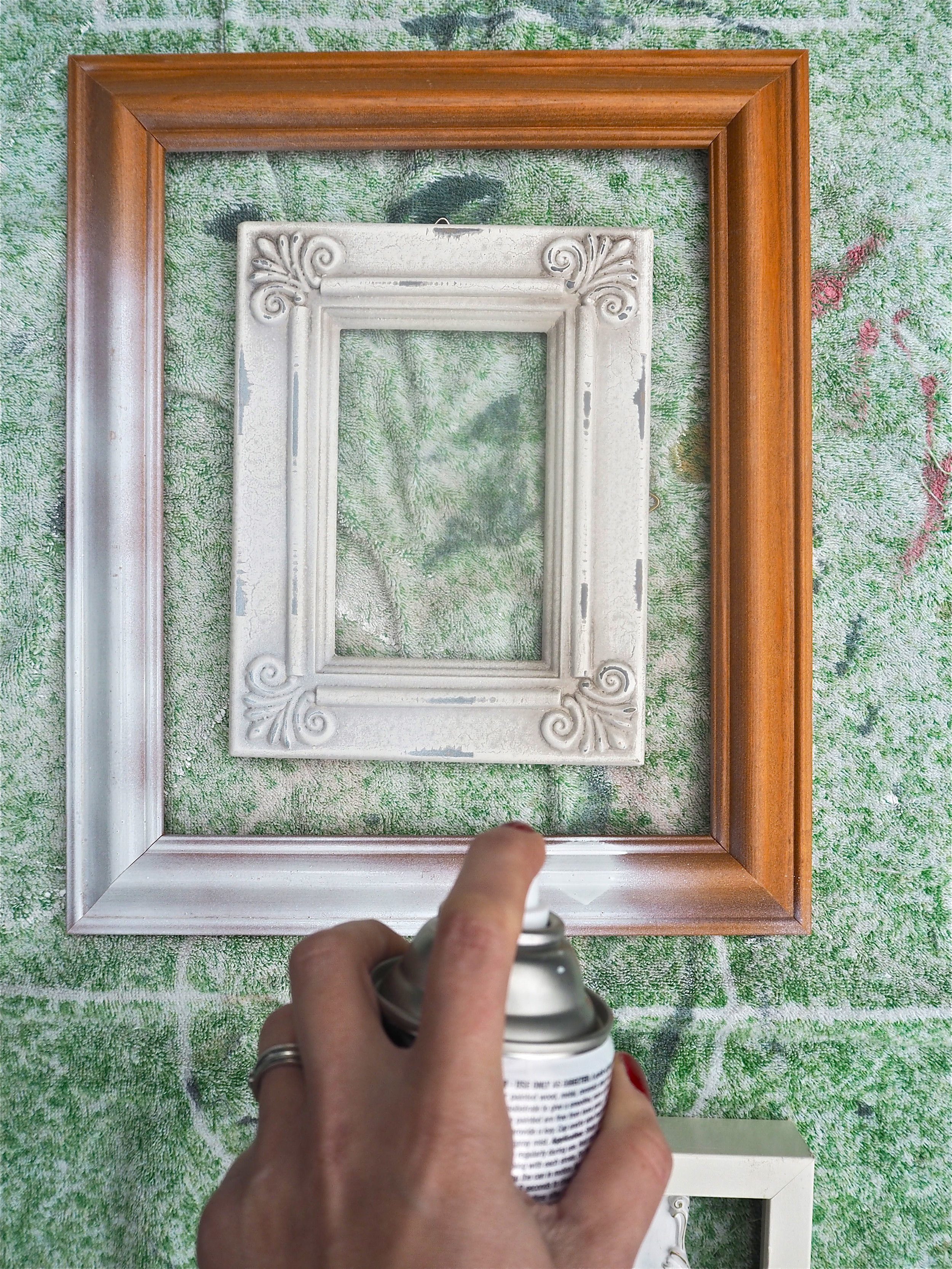
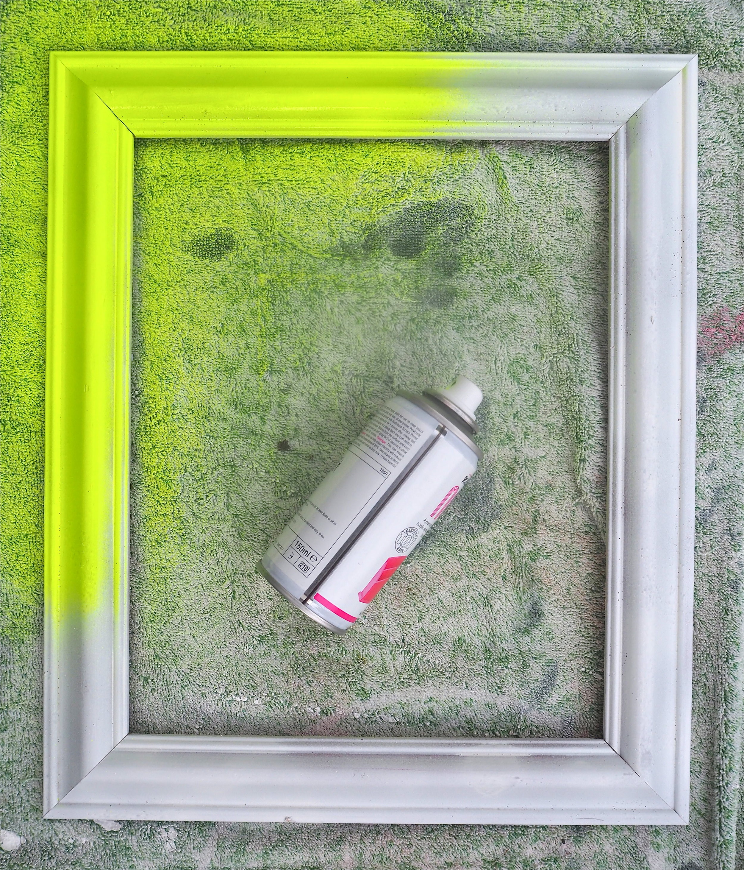
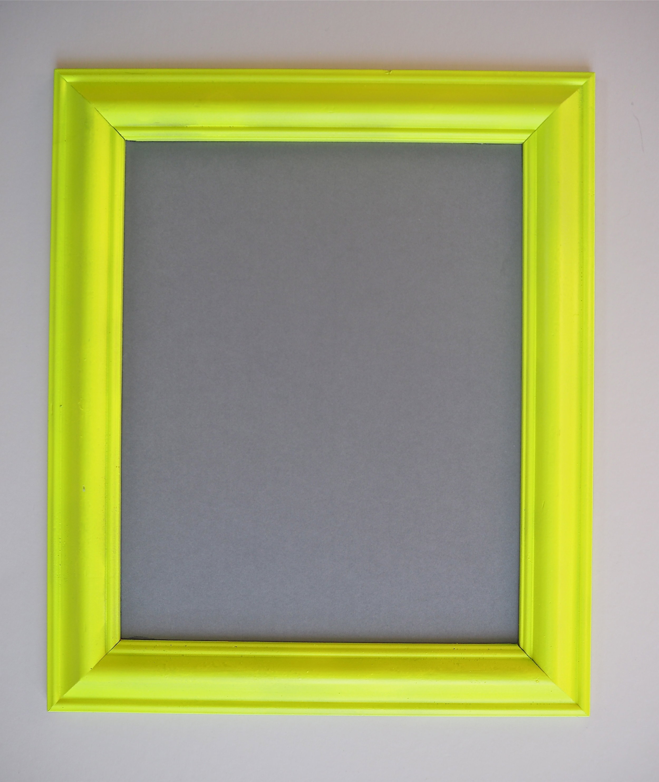
To make my frames less mismatched and more interesting, I sprayed them all in a variety of bold colours. First of all, I cleaned the frames by wiping them down in soapy water so they didn’t have any dirt or grease on them, then once dry I gave them all two coats of primer in spray-paint form. Once the primer was dry, I used the small craft tins of gloss spray paint to add some colour. I gave all the frames two coats, making sure the frames were covered in paint from each angle.

Once the frames were dry I set about creating the mount to sit inside the frame. To create the mounts I purchased a couple of coloured mounting card boards from a craft supply shop. You need your mount to be strong and not bend as a thin piece of card will not take the weight of a plastic dinosaur. If your frame came with glass you may wish to place a piece of coloured paper behind the glass and glue the dinosaur directly on top of the glass. Both the mounting card and glass options work well for this DIY.

To create the mount I measured the inside of the frame or drew around the glass that it came with. I then cut out my mount with scissors and made sure it fitted my frame and could be easily inserted. Once I was happy with the mount size I applied a small amount of Gorilla Super Glue Precise Gel to the inside of the frame and stuck my card down so it did not shift or move about inside the frame and was completely secure.

3d dinosaur art with gorilla glue

Once I was happy with what dinosaur suited a particular frame, I applied Gorilla Super Glue Precise Gel to the thin rim of the dinosaur innard. As the application is so exact, I did not have to worry about the glue spilling over the edges of the dinosaur and marking the mounting card.

I carefully positioned the dinosaur front where I wanted it to sit in the middle of the frame and held it in place for 10-45 seconds in order for the glue to adhere to each surface. I then allowed my dinosaur art to cure for 24 hours until the glue had completely set.

P2113218.JPG
3d dinosaur art with gorilla glue

Gorilla Heavy Duty Mounting Tape provides a quick and easy solution to provide a strong and secure, permanent bond to a surface. I simply cut the tape to size with scissors, applied it to the back of the frame vertically (Gorilla recommend this), removed the protective liner then pressed the frame firmly on the wall for a few seconds to grip.

3d dinosaur art with gorilla glue
P2133484.jpg

My son loves his 3D dinosaur gallery wall and it makes a real statement as part of his bedroom decor. As Gorilla Glue can take real impact, I also know the dinosaurs can take a few knocks without falling off the wall or coming apart.

3d dinosaur art with gorilla glue

Spring Decor Ideas For The Home using pieces from the new collection by Grand Illusions

The unseasonally good weather we have had this February has made me languish for spring even more than normal. When the New Year begins I always feel that I am just waiting for new buds on the trees, for daffodils to push out the ground and a sign that warmer times are ahead. One of the best ways to anticipate for spring is by freshening up your home with a few new decorative pieces that can help you embrace the season via your decor. All the colour and scent of spring is so enjoyable, why not bring it indoors?

Read More

Picking The Perfect Bunch Of Gifting Flowers With Marks & Spencer

If there is one thing that I love just as much as interiors (not counting my child and y’know…gin..) it is fresh flowers. My home does not feel complete without fresh blooms perched in the middle of the table or presented on the mantle. People often ask me what is the quickest and most budget-friendly way that they can make a room feel inviting and homely and I always tell them to invest in a beautiful vase brimming with blossoming new stems. What is even better than buying your own flowers is having someone gift you them, so I was delighted when Marks & Spencer popped round with a number of their new gifting bouquets for me to review, as well as give advice on what bouquets are perfectly suited to certain celebratory occasions throughout the year. It is important to remember that flowers are very personal, so you should always pick the right bouquet that will match your recipients personality as well as the occasion. If this all sounds very confusing then don’t worry, read on for my top tips for picking the perfect bunch….

Read More

5 Of The Best Bed Frames

I’ve not done a ‘best of’ round up for a while, so this week I thought I’d delve into bed frames. Although the online market is saturated with beds, you always just get pages and pages of the same design. Choice is often limited to the plain wood frame, the metal frame or the fabric option with a button headboard. The 5 bed frames that I want to present to you today go above and beyond the ‘basic bed’ design and are real hero pieces that won’t just disappear in a bedroom decor scheme.

Read More

Looking At Kitchen Trends For 2019 With One Of My Favourite Kitchen Suppliers, Howdens.

Whether you are thinking of installing a whole new kitchen in 2019 or just changing things up a bit, looking at kitchen trend predictions is actually a great way to ensure that you create a kitchen that you love, which also feels current and contemporary. Rather than thinking of trends as styles that go in and out of fashion in a blink of an eye, trend round-ups tend to focus on colours and materials that are elegant, stylish and therefore timeless. This is what Howdens have succeeded in doing with their new kitchen trends e-book for 2019. Spotlighting on four very different kitchen trends, Howdens can help you create your dream kitchen by identifying your core interior style.

Read More

Pretty In Pink: How I Saved Money And Was Sustainable By Updating My Existing Furniture With Grand Illusions Chalk Paint

When we moved into this house 4 years ago there was an alcove in the kitchen/diner that was screaming out for a display cabinet. The alcove to the right of the fireplace contained the fridge, but with boxes bulging with glassware and cake tins, it made sense that the other alcove accommodated a cabinet/dresser. The space is relatively narrow and the ceiling low, so it took me a long time to hunt down the right piece of petite furniture. After a two month search, I finally found the exact right thing on eBay and this pretty cabinet below became mine for the small sum of £40.

Read More

Using Treron, One Of The New 9 Farrow & Ball Colours, In My Home.

In September this year the esteemed paint manufacturer Farrow & Ball released 9 brand new colours to take their palette up to 132 hues. Without looking like I am very late to the party, I held off writing about the colours until they had been used in abundance in ‘real homes’. The thing is with Farrow & Ball press images is they are just so good. They hire the best stylists and produce the most amazing pictures, they could probably rub a dog turd on the wall and it would look like a desirable colour to paint your guest bedroom in. What I really wanted to see was how the colours would look in different types of homes and in different settings. Plus, when I received the press pack (which included sample tins of the 9 new shades) there was one colour in particular, Treron, which I flagged for use on the tongue and groove in my bathroom.

Read More

My Prediction For The Big Interior Trends of 2019

A few weeks ago I attended a bloggers dinner at the Miele London showroom to talk all things interior trends for 2019. Before the event all the bloggers were asked for their predictions beforehand and it was quite surprising to see that we were all pretty much on the same page to what we think is ‘over’ in interiors, and what we think will be the next thing that everyone will be doing in their home.

Read More