Hallway Makeover Reveal With M&L Paints
AD / This post has been sponsored by M&L Paints. However, all colour choices, opinions, painting and decorating has been carried out, as usual, by me!
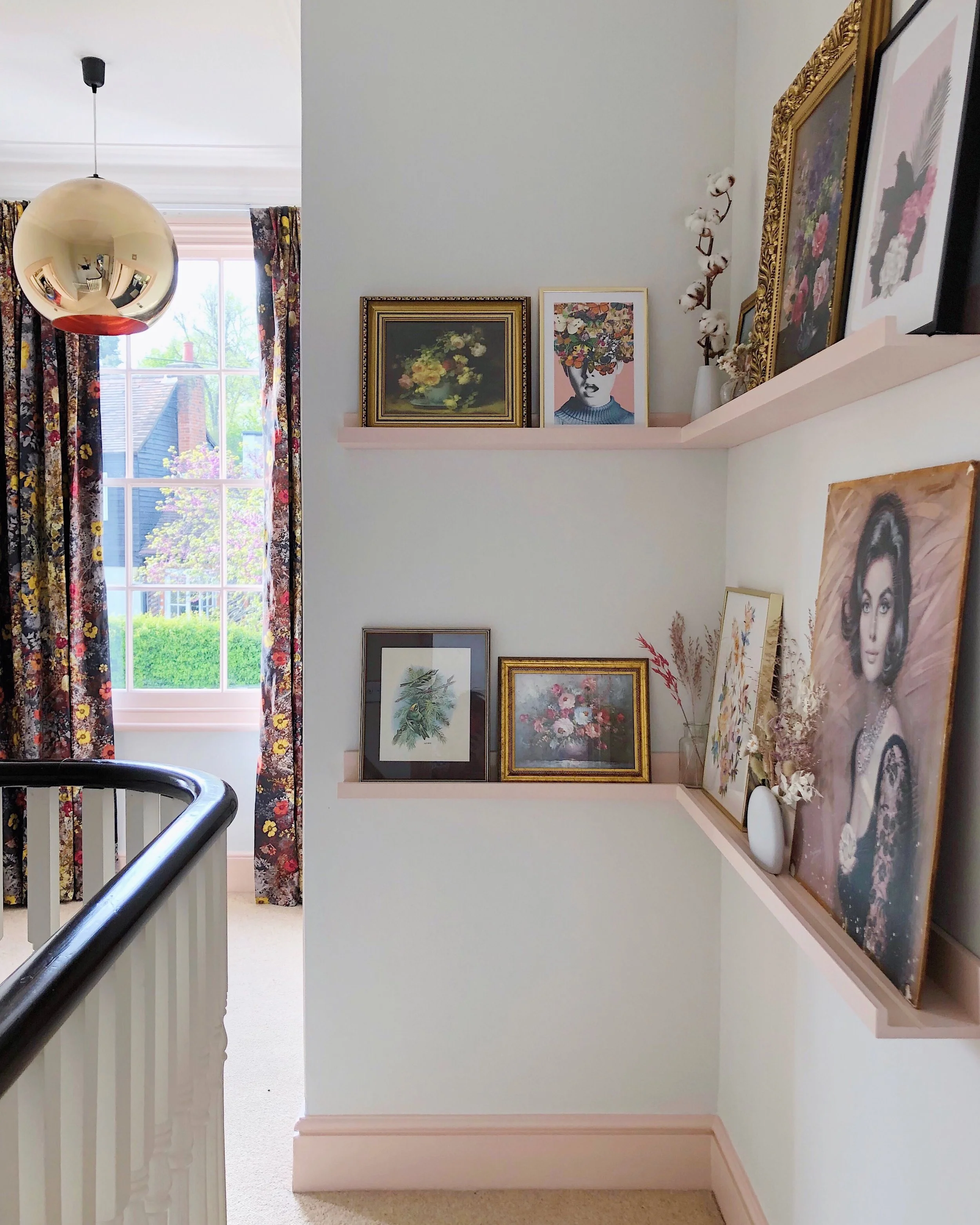
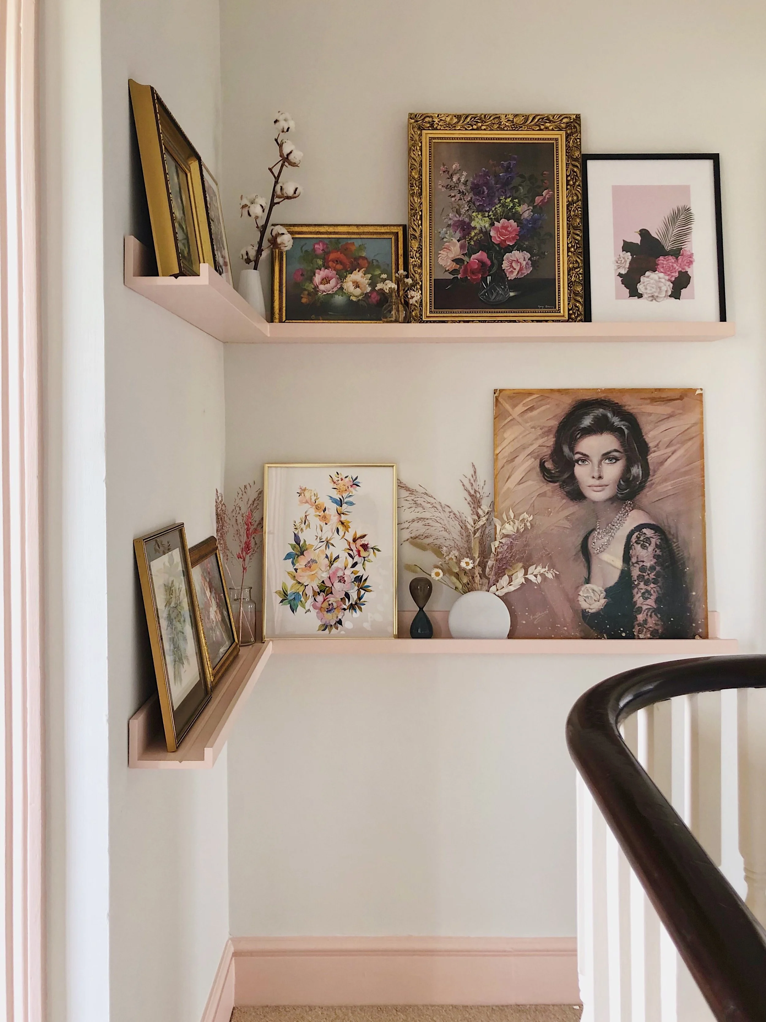
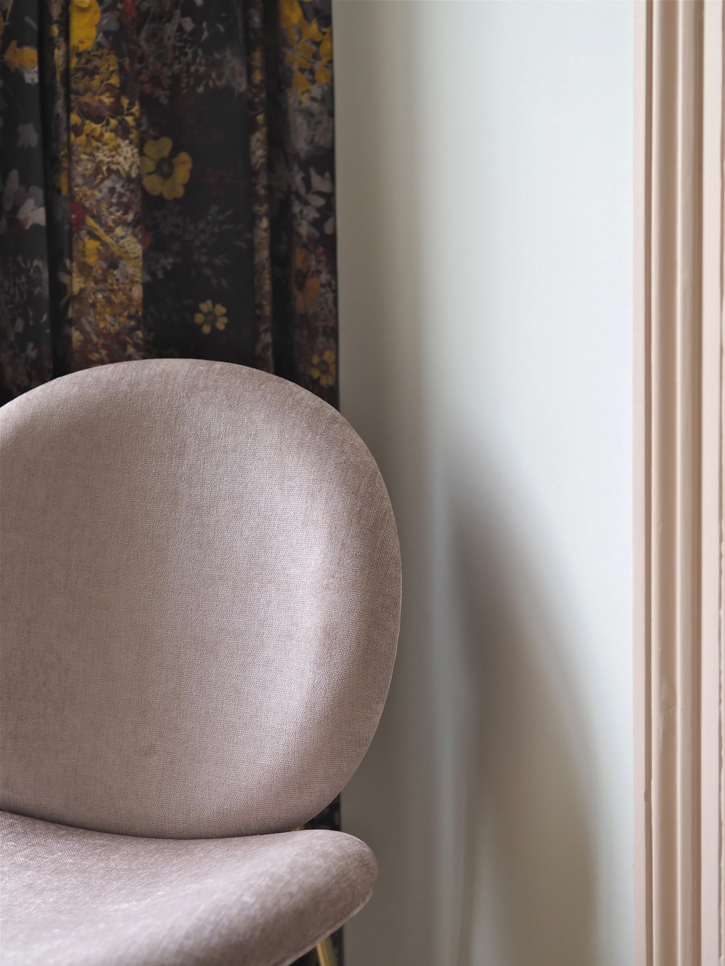
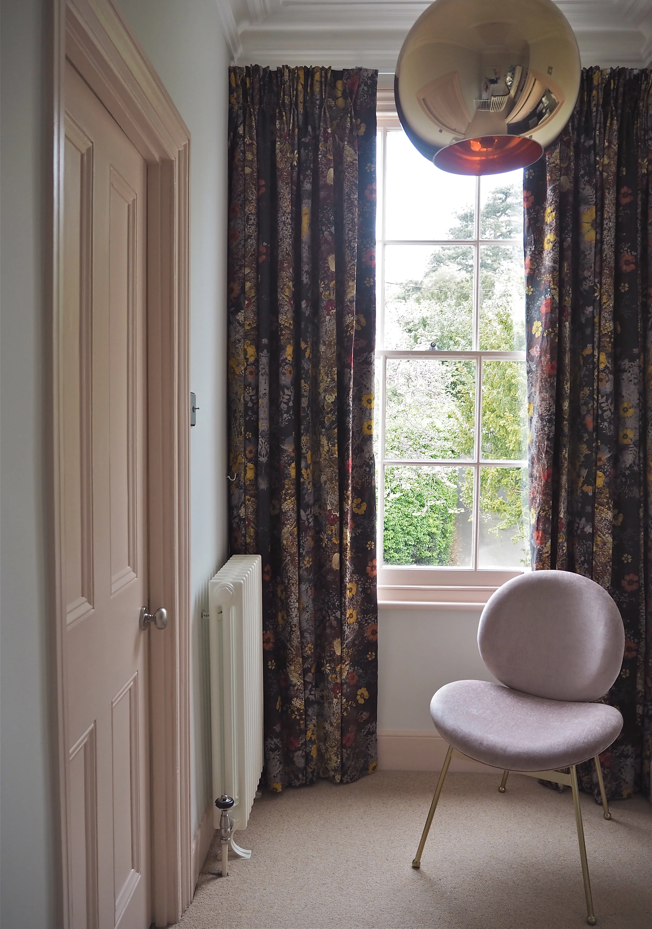
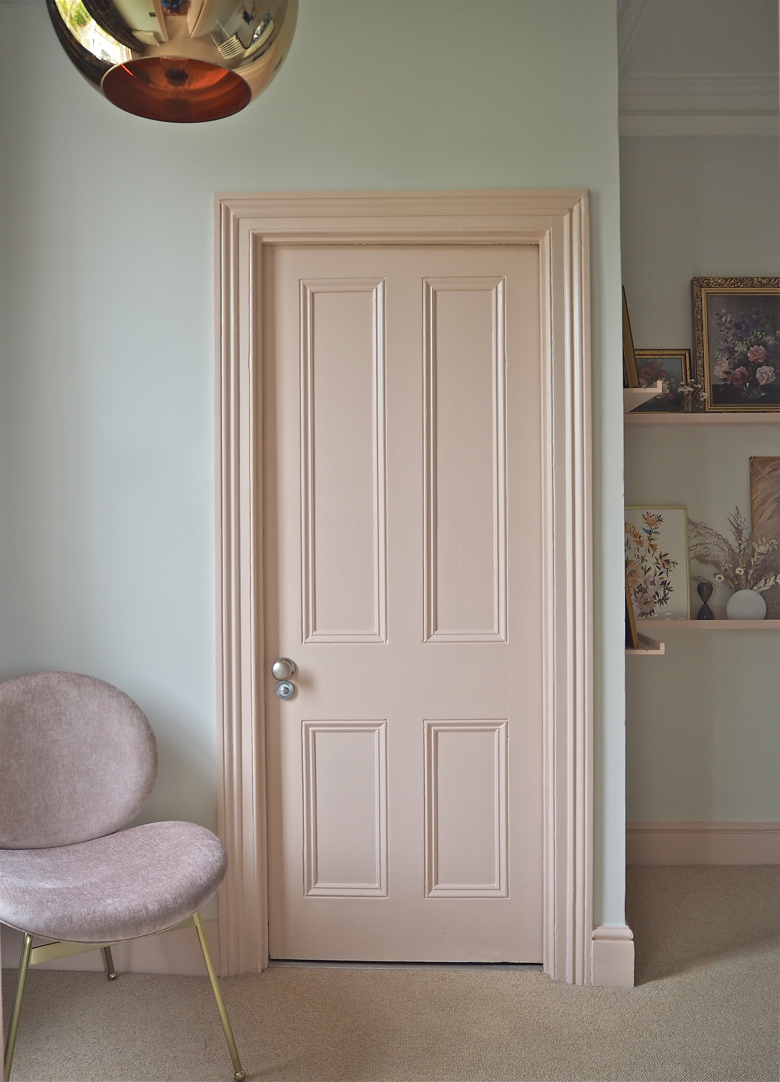
This hallway reveal is really a tale of two designs. The upstairs landing is pretty, pink and floral as planned (you can read more about that and see all the ‘before’ pictures here). While the the lower floors are more contemporary and the colour choices were only decided on halfway through the decorating process.
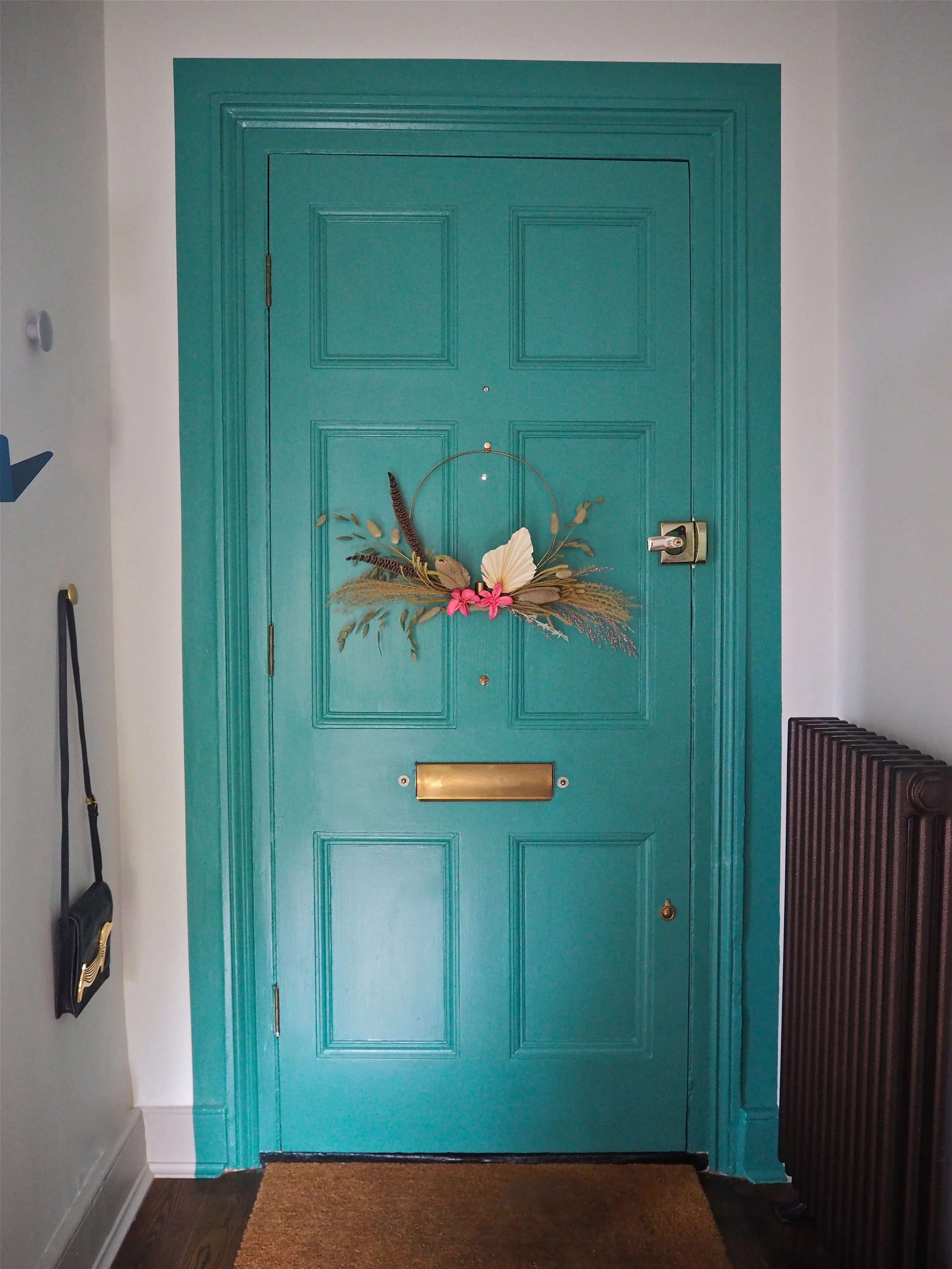
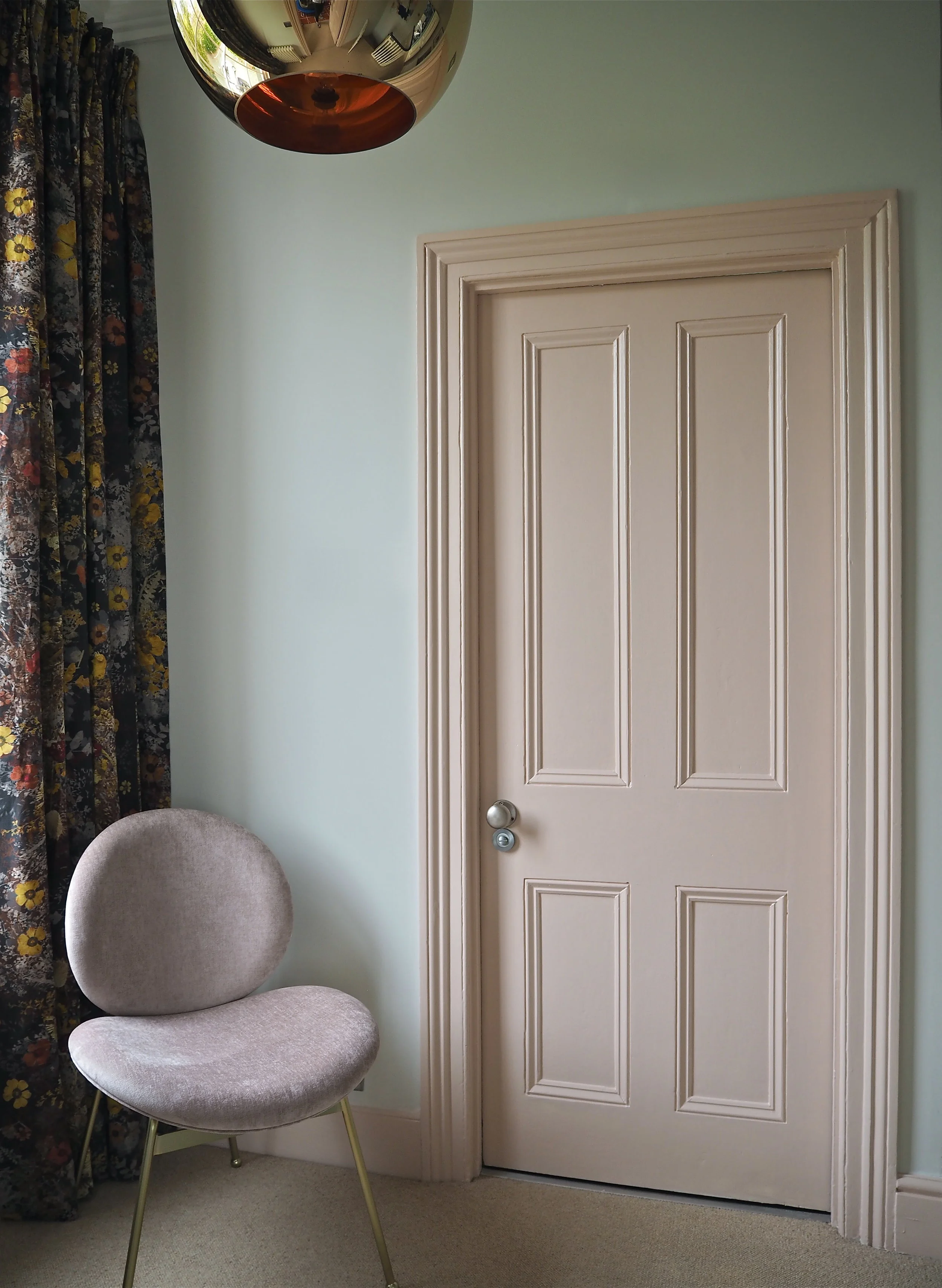
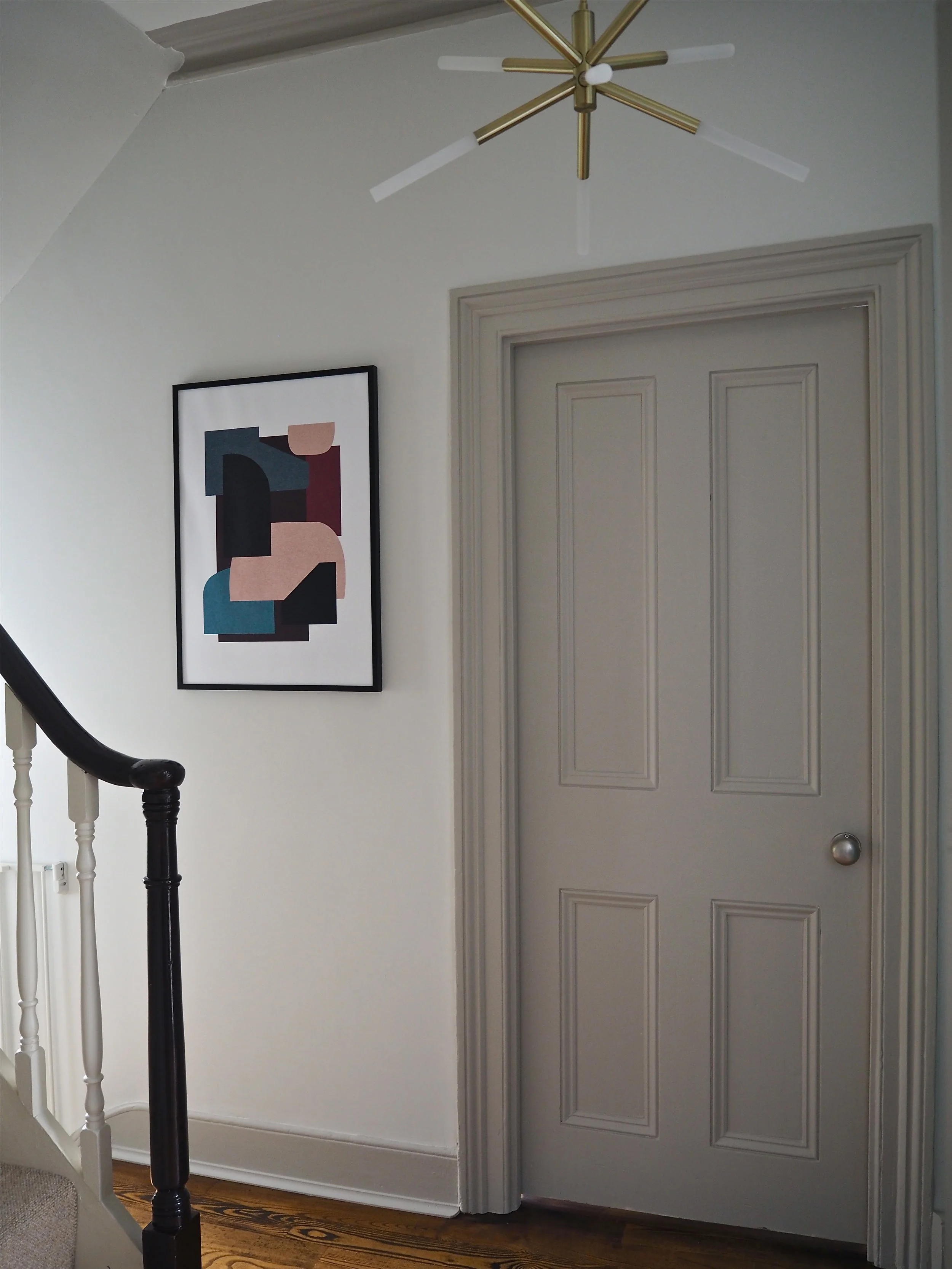
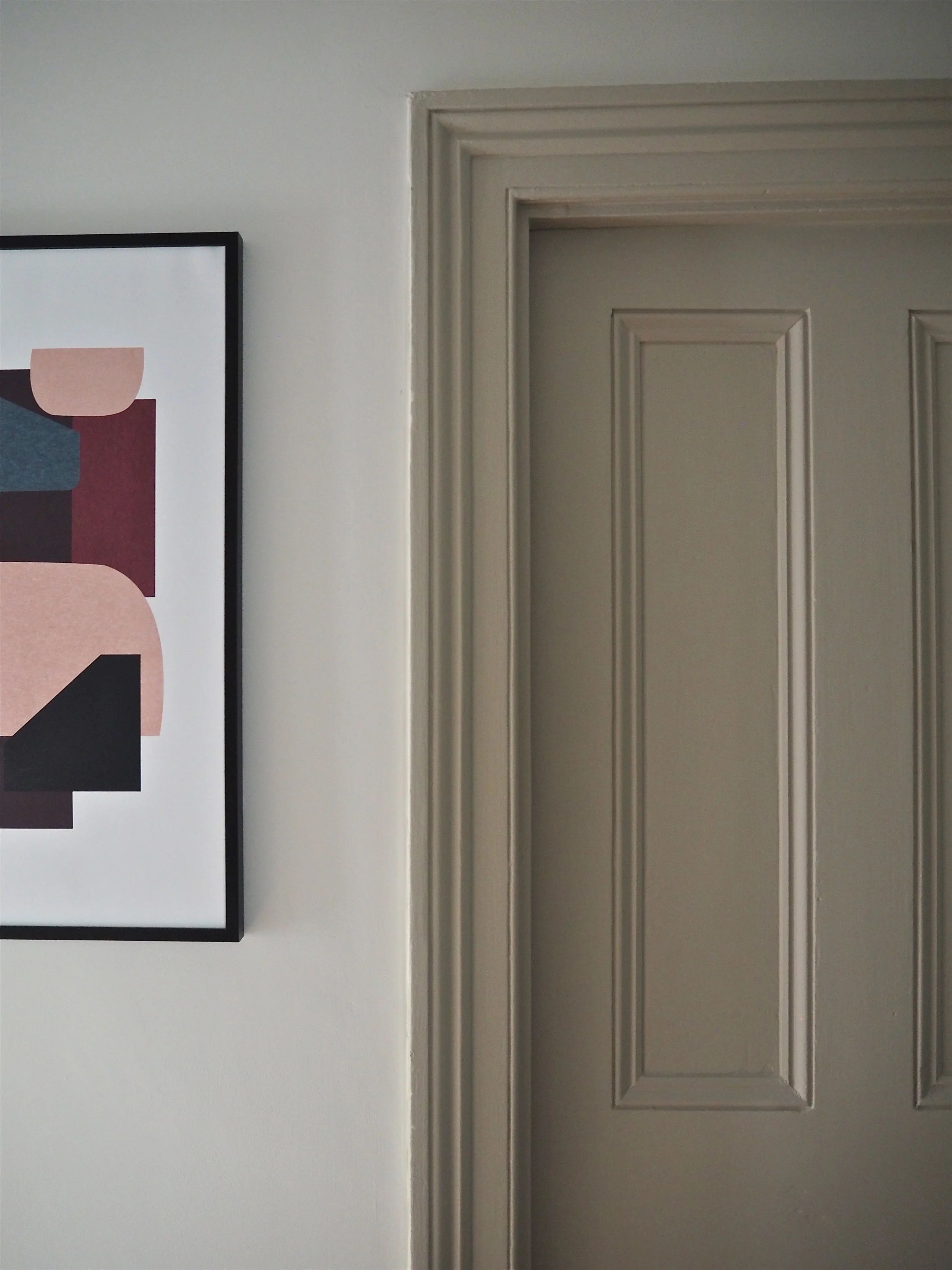
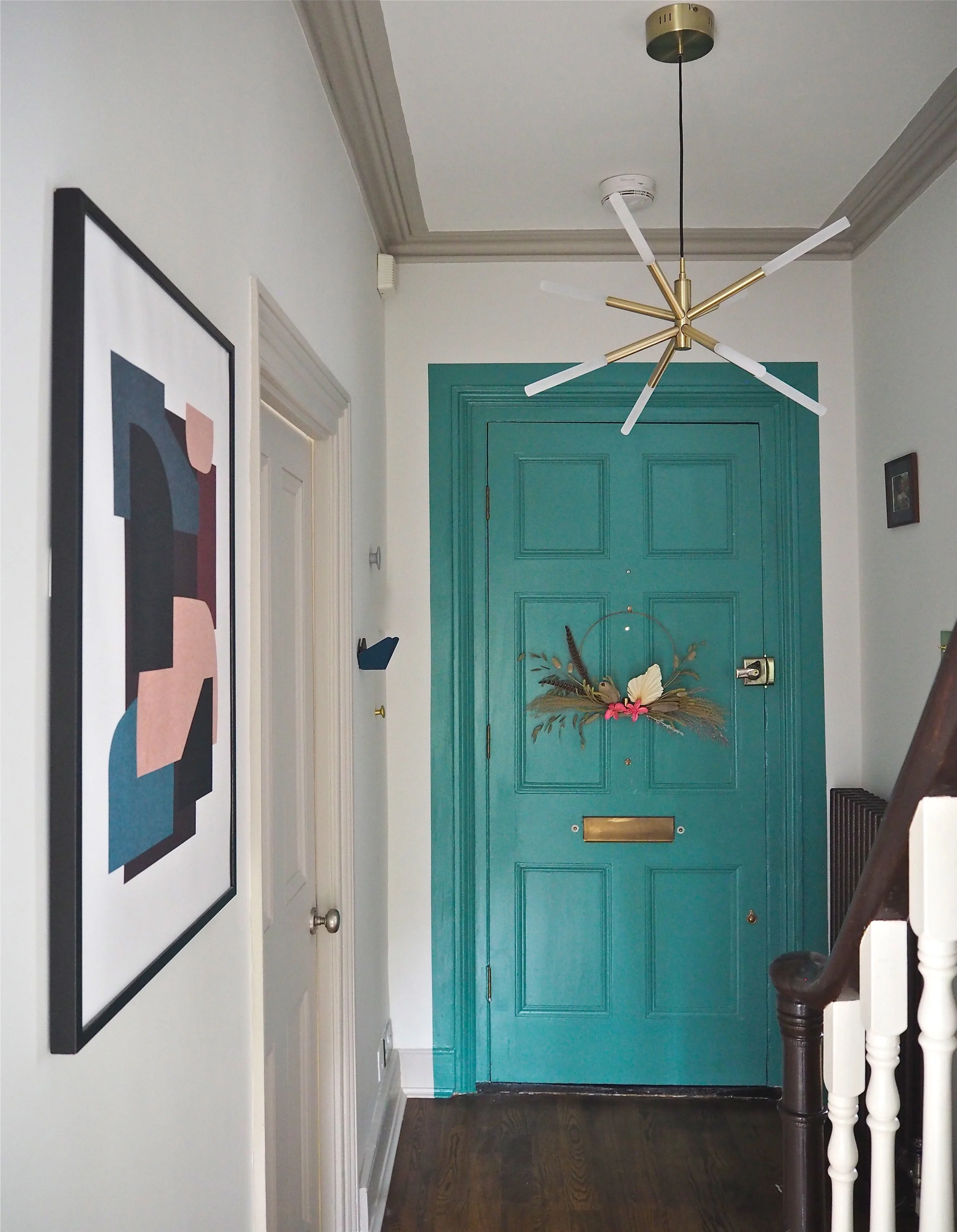
For this project, I decided that the skirting, doors, windows and coving would be made key features using colour, while the walls would simply be the backdrop. This is in reverse to how the hallway looked before, which was the traditional ‘colour on the walls + white woodwork’ look. The main aim of this makeover was to add some much-needed interest to the space and while I had considered adding mouldings and panelling, I felt it would be too imposing on the narrow area. The period doors and original coving were already great features, so it was these that were to ‘sing’.
I know these ‘reveal’ posts are all about the pictures, so here are the main shots of the two conjoined spaces and I’ll talk in detail about each area further down:
Before, the top of the landing was the area that really suffered from the previous bad choices in colour and design. The light that shot up the stairs made the former green paint colour look shiny and more lime-coloured throughout much of the day. This was why a really matt paint from M&L would work as I was not looking for a glossy sheen here at all. Hallways can be really difficult spaces to decorate due to light coming from different areas and just the actual scale of them. Each room off the hallway was also quite a riot of colour and pattern and so to create a better flow between them, I knew I wanted the hallway to be neutral. If the woodwork was also going to be the ‘hero’ in terms of colour, a white base was a great canvas to work from.
When I previously painted this hall in a different brand of paint, it took three coats on the walls to get a decent amount of coverage. As you can see from the images, this hall has some very tricky, high areas that are not exactly fun to paint. I was delighted to find that with M&L the walls only required two coats, which I was surprised about considering I was putting a white over a darker colour (which can require a bit more effort to erase).
The hallway walls with just one coat of ‘English Plaster’ by M&L Paints…
What I also loved about M&L Paints was the complete lack of splashing and spotting. The paint is thick and creamy so you do not get covered in paint spots on your arms, face and floor! It was so drip-proof I actually became quite relaxed about even covering the floor while painting. I’ve used a lot of paint brands and I have to say this was the least ‘drippy’ I have ever used.
As the focus of this area is the Niblock door going and up over to the Hessian coving, I needed to update the light fitting to something more suited to the colours being used. This LED chandelier is by MADE.com and is called ‘Wanda’. As it is LED is requires no bulbs! I also think it is great value at £169.
So that’s my huge hallway makeover! I have to say I’m really happy with how it worked out. I avoided making bad choices by waiting to see how one area worked out before planning the next stage. I also used the colours I loved and wanted to include such as Niblock and Plaster Pink and chose colours that complemented those to work alongside them. I really hope you like it too. Let me know what you think via the comments box below….
