Dulux Names Brave Ground As The Colour Of The Year For 2021
There was going to be no way out of it - any future trend for the home would have to take into account the huge impact that COVID-19 has had on all of us this year. As life as we know it has been turned upside down and we continue to spend more time indoors than ever before, Dulux embraced the collective mood and selected the warming neutral of ‘Brave Ground’ as their Colour Of The Year for 2021. The earthy, natural brown undertone of Brave Ground was considered a shade that enabled ‘people to draw upon the strength of nature to help them find the courage to embrace the future.’
While Dulux’s Colour Of The Year for 2020, ‘Tranquil Dawn’, invited us to disconnect from technology and relax with its soft green hue inspired by the morning sky; ‘Brave Ground’ summons us to gain courage and strength in order to move forward in uncertain and challenging times.
This is the 18th year that Dulux have once again welcomed a panel of colour designers, trend forecasters, design specialists, architects and editors from around the world to come together to define one colour that encapsulates the moment. It could be argued that out of all previous years, the Colour Of The Year for 2021 would prove the most challenging. Marianne Shillingford, Creative Director at Dulux UK says: “The colours on our walls are the backdrop to how we live our life. For many of us, lockdown has served to emphasise how important our home environment has become, it has been the place where we work, learn, relax. It can lift us up, nurture us, comfort us.”
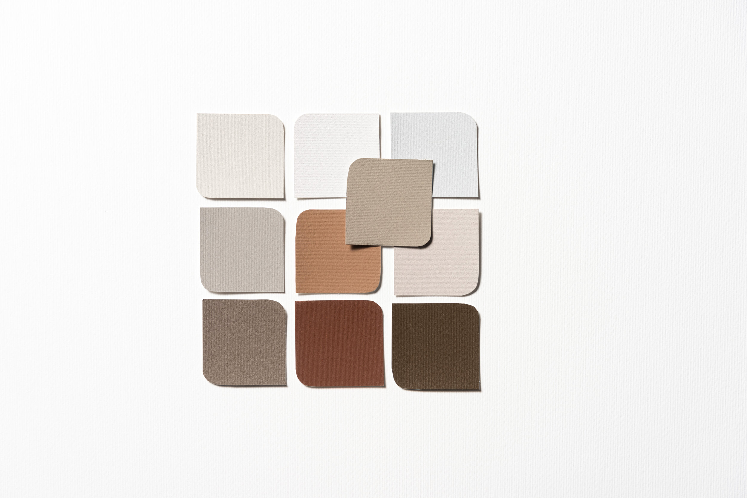
The great thing about a neutral, versatile shade like Brave Ground is that you can use practically any colour to accompany it. It makes a great backdrop to stronger colours like red and pink, while more natural tones such as green and blue accentuate it. To help customers successfully use the shade in their own home, Dulux has suggested four colour palettes which work well together as a decor scheme:
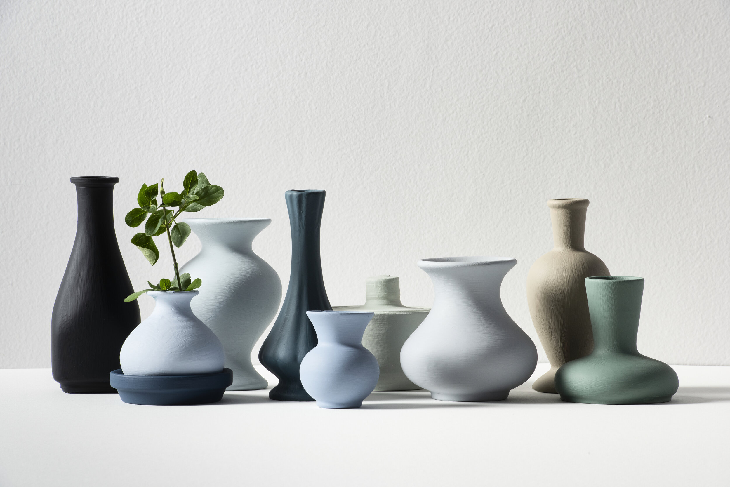
Painted pots in all the colours featured in the four accompanying palettes to Brave Ground.
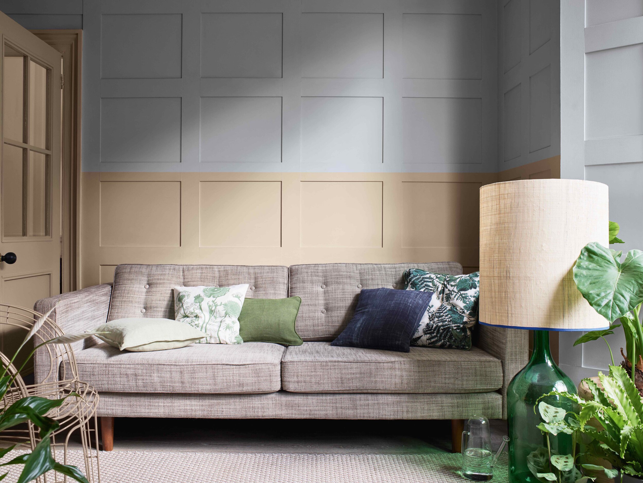
Blues and greens are the colours of the land, the sea and the sky, so the earthy tone of Brave Ground sits comfortably within this organic and wholesome colour palette. Perfect for a relaxing living space, the shades in this palette are youthful but sophisticated.
The Earth Palette of Dulux paint colours.
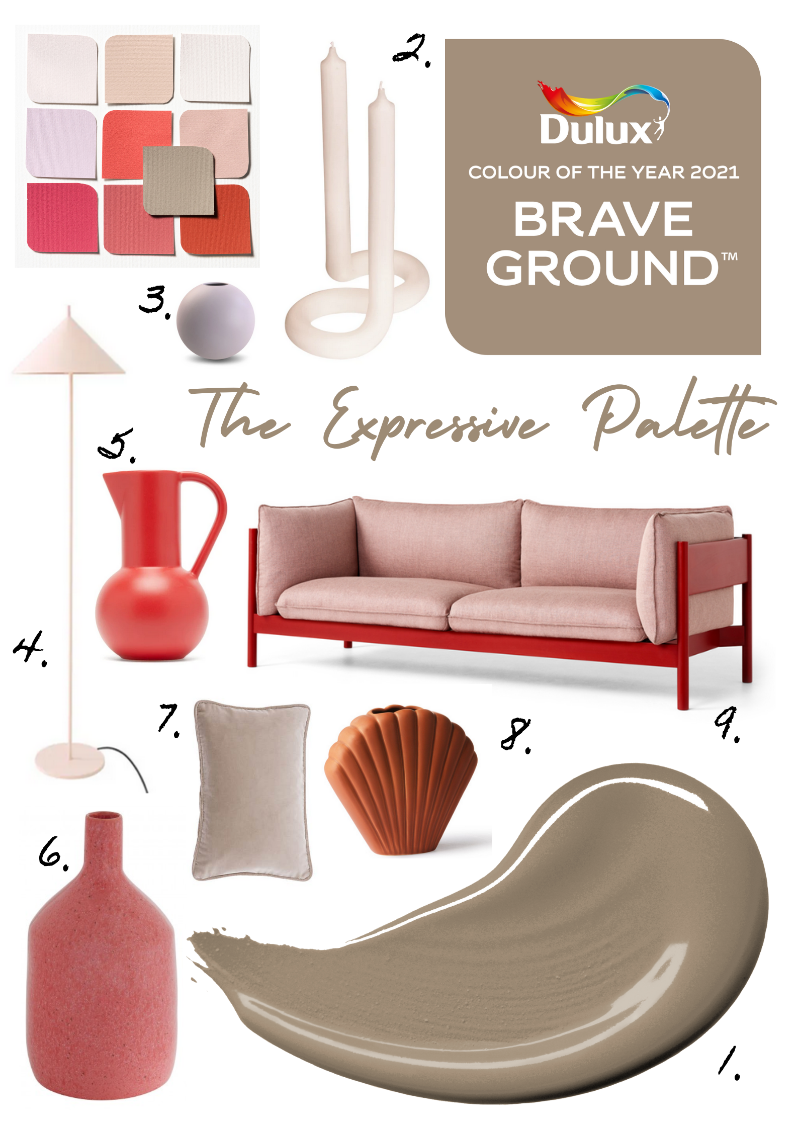
This modern and contemporary colour palette is a good addition in the line-up as it exhibits how powerful tones can be used with a soft, neutral shade that isn’t just white! Pinks, burnt oranges and coral hues actually work really well with brown and grey-based warm neutrals, which lift up their vivid pigments.
The Expressive Palette of Dulux paint colours.
How I would decorate a room with the Expressive Palette! 1. Brave Ground by Dulux. 2. Lex Pott twist candle in peach via Trouva 3. 10cm lilac vase by Cooee via Nordic Nest. 4. HK Living nude lamp via Trouva 5. Large Strom Jug in red via W.A.Green 6. Pink Vase via Habitat 7.Cotton cushion via Dunelm 8. Shell Vase via Trouva 9. HAY Arbour sofa in Red Beech via Nest.
While many people shy away from using yellow and mustard tones in their home decor schemes, these colours can actually bring vitality and energize a space. To tone down these shades, brown-based warm neutrals like Brave Ground are a great accompaniment. Why not try painting out a bedroom in Brave Ground, then paint the illusion of a yellow headboard onto the wall behind your bed for a bright and positive space that isn’t overbearing?
The Timeless Palette of Dulux paint colours.
Chic and modern, the Trust Palette is very contemporary Scandi. The range of soft greys, shaded whites and taupe colours work well with natural wood in the furniture and home accessories.
The Trust Palette of Dulux paint colours.
So, what do you think of the Dulux Colour of The Year? Does it speak to you as a strong, natural colour which looks forward? Or, do you think Dulux should have chosen another hue that reflects this dramatic climate? I’d love to know, so do leave me a comment in the field below…
All photography featured in this post is owned and belongs to Dulux. The mood board was created by Melanie Lissack Interiors.
